Please read the Licensing terms before you download this content.
Overview
How it works
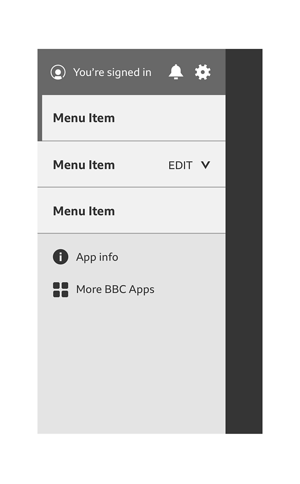
The side drawer is made up of two patterns: accordion and account in apps.
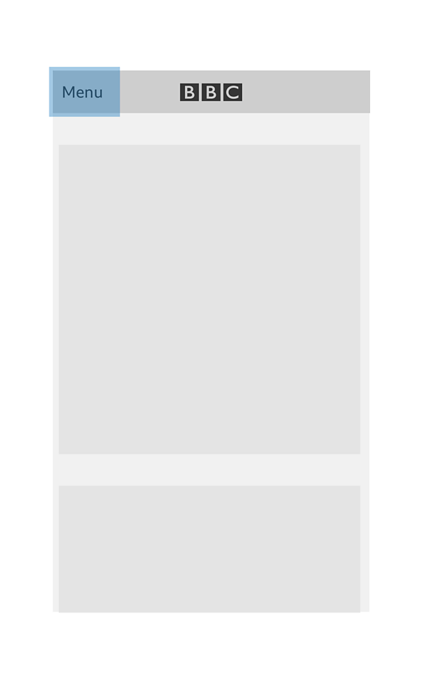
When you open the app, you should see a 'menu' button in the far left of the app bar. There should be plenty of breathing space around the 'menu' button for you to touch without hitting any other button. To find out more, read our guide on how to design for touch.
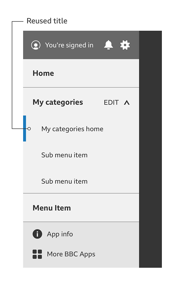
The menu will expand and sit over the content of the app. The menu can be closed by either tapping outside the menu or swiping to the left. The account menu module will sit at the top of the area of this menu.
The settings option is represented by the GEL 'cog' icon. Choosing this will send you to the settings area within the app.
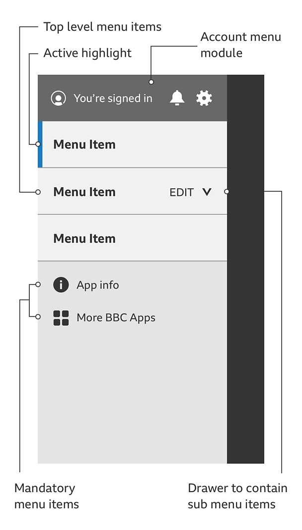
The menu is made up of a list of items, which can also include an accordion to give people access to collapsable menus, called sub menus. This is handy if there is a lot of sub-categories to be held under one menu item. A 'chevron' icon is used with these to show if something is opened or closed. A thin strip of colour on the left shows which menu you've selected. This is known as the 'active highlight'.
It's up to each product to decide whether the sub menus should be collapsed or open when you enter the app.
The 'edit' option in the menu item lets people add, subtract or change elements within that section. Selecting it will take you to an area within the app where you can make these changes. You don't have to display the 'edit' button if your app doesn't need it. But if it does - make sure it goes here.
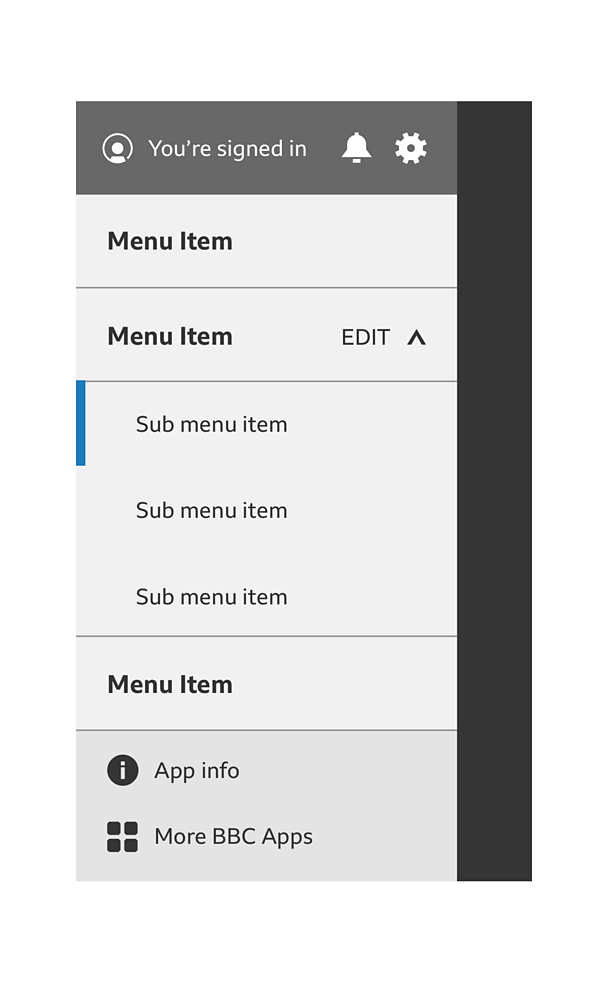
Under the list of menu items sits the mandatory menu links for 'app information' and 'more Â鶹ԼĹÄ apps'.
- 'App information' takes you to the app information area of the app. This contains links to important information such as privacy policy and terms of use.
- 'More Â鶹ԼĹÄ apps' takes you to the App store on iOS and the Play store on Android for you to browse more Â鶹ԼĹÄ apps.
Rules
- The side drawer menu must be exposed when you first come to the home screen, to aid discoverability. It's up to each product to decide whether the sub menus should be collapsed or open when you enter the app.
- The account menu module must be used in the side drawer menu of any app that uses Â鶹ԼĹÄ accounts.
- Try to stick to both iOS and Android native patterns as closely as possible within the confines of GEL.
- The 'app information' and 'more Â鶹ԼĹÄ apps' items must always be at the bottom of the side drawer menu and be accompanied by their icons.
- Any menu item can have an 'edit' Call To Action (CTA).
- Menu item text should be no longer than a single line.
- Sub menu items can have multiple lines. It's best to stick to no more than two lines of copy.
- The settings option is represented by the GEL 'cog' icon on iOS and Android.
Sub menu items in a drawer
- An accordions top-level menu item can never be a link. Whilst you can reuse the title in the sub menu, it must be unique. ie: 'my categories' becomes 'my categories home'.
Sub menu items with no drawer
- When a menu item has sub menu items but isn't a drawer, the title can be used as a link. It doesn't need to be repeated as the first sub menu item.
- If the title item is not a link, reduce the opacity to 70% to showcase that it's not active.

Accessibility
- Branding the menu is encouraged but not at the expense of the pattern guidelines. The active highlight, text colour, icons and profile background colour can be product specific but they must be accessible. To find out more, please read our guide on how to design for accessibility. For more details on branding, see our downloadable assets link at the top of this page.
- There should be an invisible 'close' button at the bottom of the menu for people with accessibility features turned on.
Variations
Use with a bottom navigation pattern
The side drawer Menu on its own is a primary navigation pattern. However, be cautious of using it in conjunction with a bottom nav. In this case the side drawer pattern becomes secondary navigation and it's important to consider its role in the navigation, in order to keep the content structure clear and avoid confusion for users.
Content
When the side drawer menu becomes secondary navigation, it shouldn't duplicate primary navigation items. It should be an opportunity to give the user easier access to other aspects of the app such Sign In, App Settings, App Information, More Â鶹ԼĹÄ Apps or other sections that might be required.
Label
The label associated with the side drawer nav should set the expectation of the content inside of it.
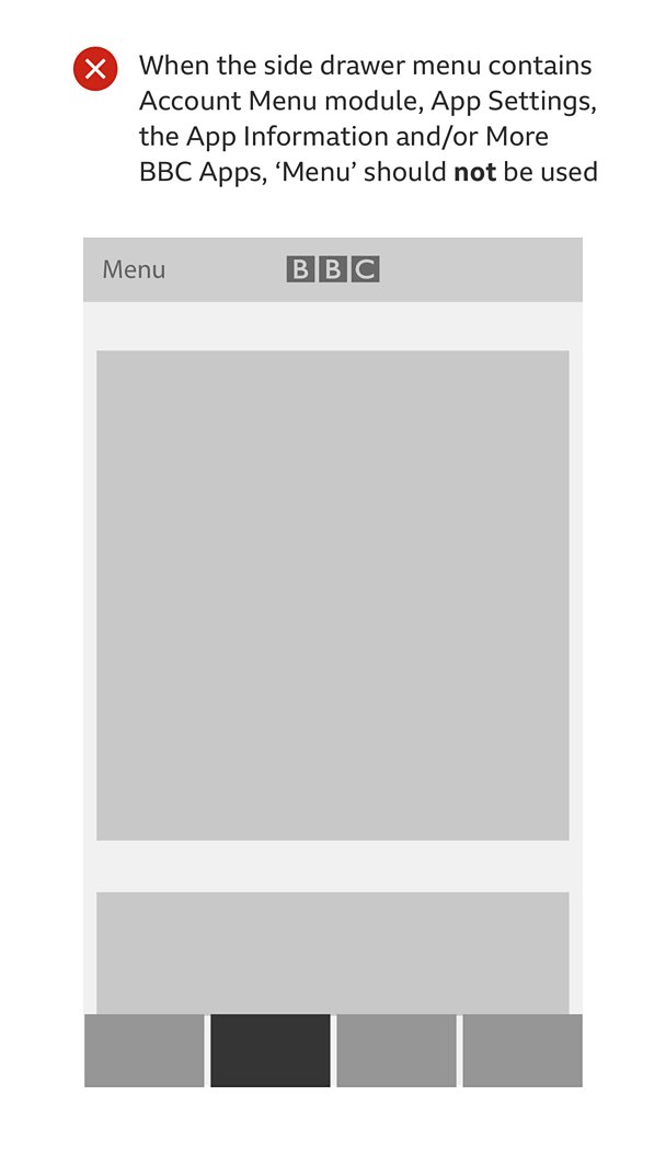
When the content in the side drawer menu contains Account Menu module, App Settings, the App Information and/or More Â鶹ԼĹÄ Apps, 'Menu' should not be used as it doesn't describe the content inside. We know this causes confusion with users.
In this case the label could be a Settings cog (for apps without Sign-in) or an Account Icon (for apps with Sign-in), which would be much more indicative of the content and functionality inside.

Pattern in action
This pattern is currently being used by the Â鶹ԼĹÄ Bitesize app and the Â鶹ԼĹÄ+ app, available here:
/
/
Licensing
These assets are available for download on the following licence terms:
You can:
- Download the assets and use them free of charge;
- Use the assets without attribution; and
- Modify or alter the assets and edit them as you like.
You can't:
- Use the assets in a way that would bring the Â鶹ԼĹÄ into disrepute;
- Make available the assets so that they can be downloaded by others;
- Sell the assets to other people or package the assets with others that are for sale;
- Take payment from others to access the assets (including putting them behind a paywall);
- Use the assets as part of a service that you are charging money for; or
- Imply association with or endorsement from the Â鶹ԼĹÄ by using the assets.
Disclaimer: The assets are offered as is and the Â鶹ԼĹÄ is not responsible for anything that happens if you use them.


