Overview
How it works
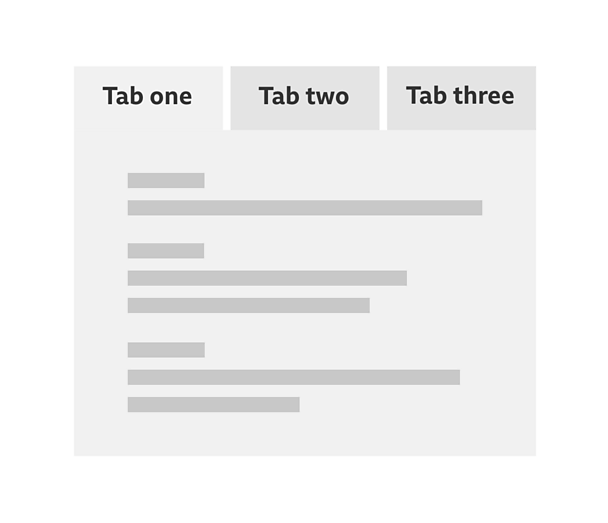
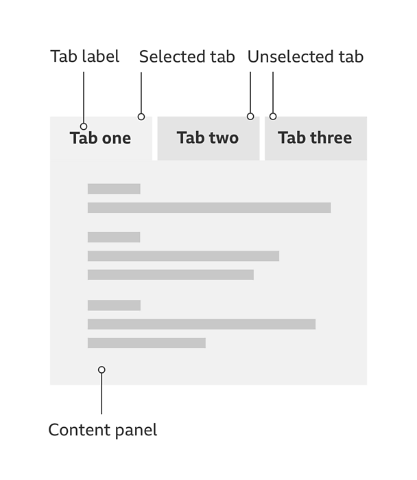
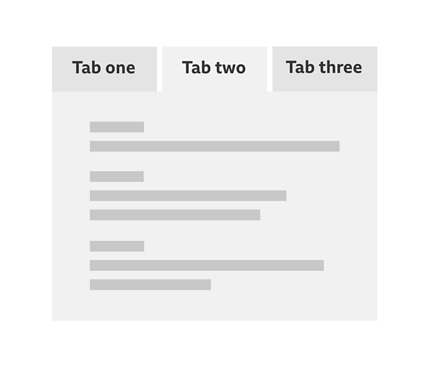
Tabs are best used to separate content into smaller groups of related information. The pattern is made up of three parts:
**Tab: **A small, labelled box that can be interacted with and selected.
**The tab list: **This is where you can see all the tabs that are available, at the top of the pattern. These control what tab panels are shown.
**Content panel: **This is where the tab content is placed.
As a default, one tab will already be selected and its related panel will be visible on the top of the stack. These are known as 'selected' tabs.
'Unselected' tabs are ones that haven't been selected yet. These will not be highlighted but they should still be clear.
Note
Remember to look at our touch guidelines for more information on making your designs touch-friendly.
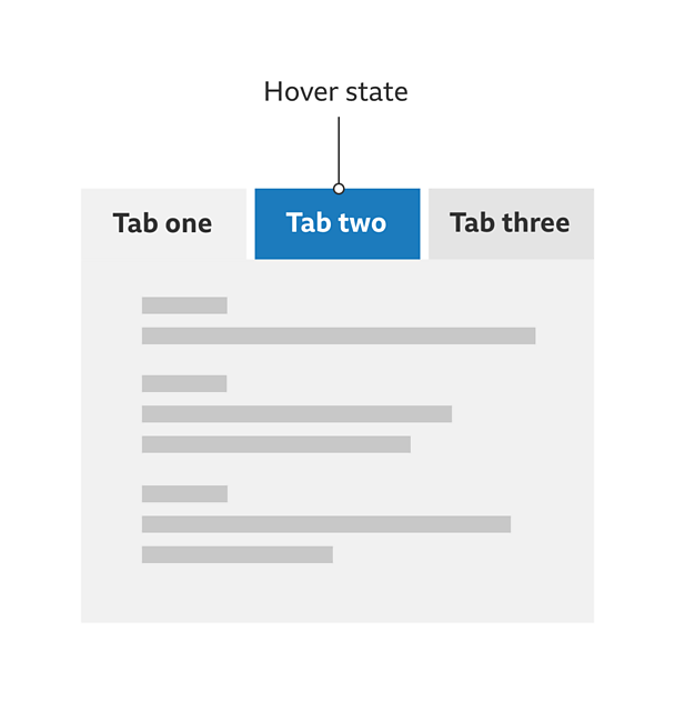
Select any of the other tabs to reveal their content. This interaction should use focus and hover states to make clear which tab is being selected.
The content panel you want will be brought to the top of the stack and the tab connected to it will become the selected tab.
Rules
As a default, there must always be one tab that's already selected and the content panel below it must be visible.
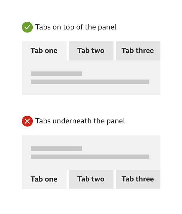
Tabs should always be placed above the content it relates to. Don't put them underneath.
- The minimum number of tabs you can use is two.
- It must always be clear which tab is the selected tab.
- In a tab module, only use one row of tabs.
- Only one content panel can be shown at a time.
- The order of the tabs from left to right should never change. Only the content panel should change.
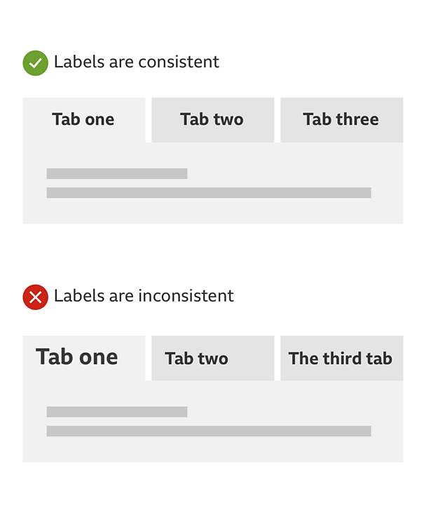
- The label text for each tab should have the same font size and be aligned centrally. They shouldn't be longer than one or two words and be accurate in their description. They should also make sense when read in isolation (for example, by a screen reader).
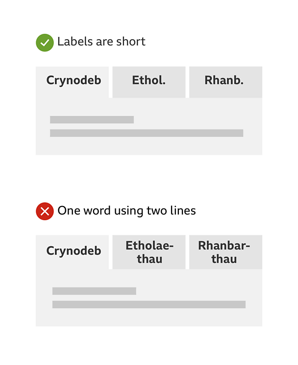
Languages such as Welsh may have single words that are long and hard to fit into some tabs. Do not use two lines of text for words like this. It is ok to shorten them using full stops but make sure the description is still clear.
- Tabs can include icons. Like text, these should be aligned centrally.
- Do not introduce scrolling into the content panel.
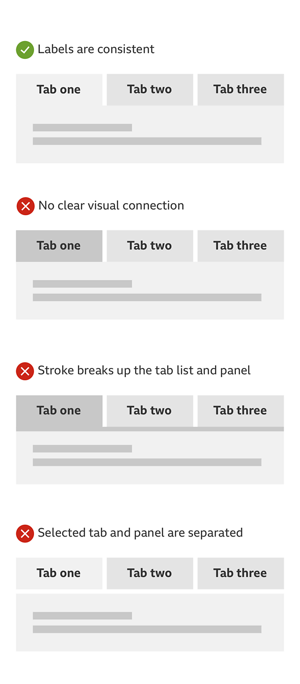
- There should be a clear visual connection between the selected tab and the tab panel. An easy way to do this is to give both of them the same background colour.
Accessibility
Visual considerations
- There must be a clear colour contrast between the selected and the unselected tabs.
- A hover state must have a clear colour contrast with both the selected and unselected tabs.
- Make sure the colour of the text contrasts well with the backgrounds of the selected tab, the unselected tab and the content panel.
Considerations when there's no Javascript
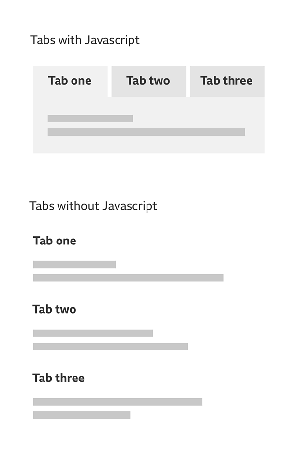
When there is no Javascript the tab content won't be able to appear stacked on top of each other. In cases like this, all of the tab content should be exposed and separated by headings. These headings should have the same text as the tab labels.
You can include a list of links before the content. This clarifies the content order and allows people to jump straight to what they want.
This solution also works for people who use screen readers without Javascript.
Considerations for screen readers
If you are using a screen reader with Javascript turned on, you should be able to navigate the tabs pattern in the following way:
- Use the tab key on your keyboard to access the tab labels
- Use the return key to select the tab
- On selection, keyboard focus is pushed to the content panel
The content panel should always have a heading to reduce confusion for people using screen readers. This heading can be visually hidden.
Remember, the key questions that people need answering are:
- What tab am I on?
- How many tabs are there?
- How do I change the tab?
We would recommend using the ARIA tab model. This works across all major screen readers and browser combinations. .
Variations
Using tabs in a small container or on a small device
Roughly three tabs can fit into a small device or container. If more tabs are required or the labels are particularly long, consider using a horizontal scroll with backward and forward buttons. But be careful of clashes between gestures, particularly with screen reader enabled.
If you have a large amount of content or data, the filter pattern might be more suitable.
Tabs for Â鶹ԼĹÄ World Service sites
Some of the Â鶹ԼĹÄ's World Service sites are designed for languages that are read from right to left. These include Arabic, Urdu and Persian.
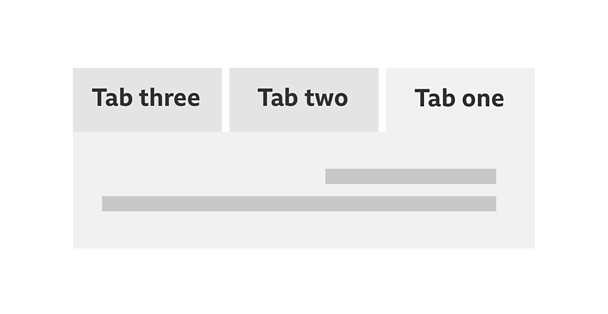
If you want to use tabs on any of these sites, you must make sure the tab order begins from the right and the content is aligned in the same direction.
