Overview
How it works
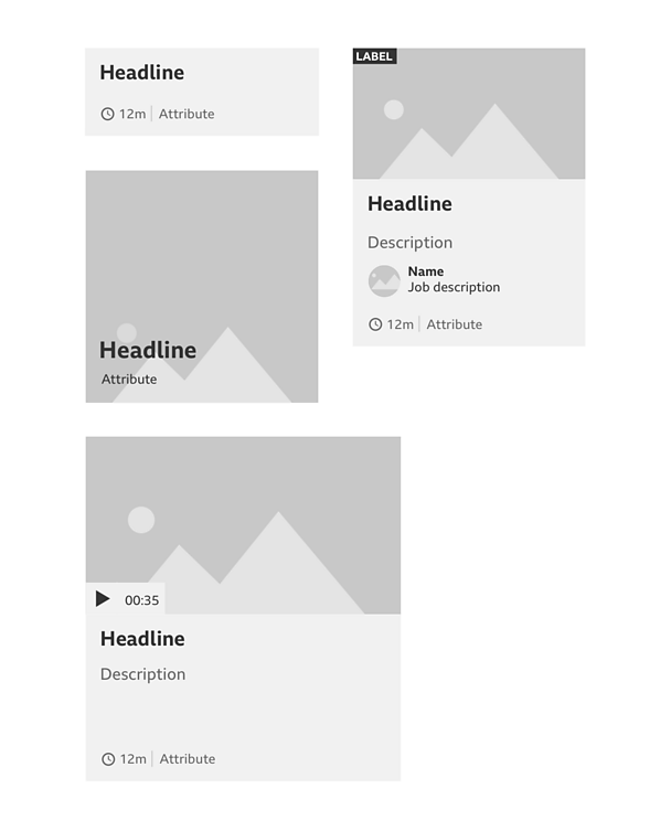
A promo needs to give the user information about what it is pointing to, as well as telling a compelling story. A promo can be made up of different parts in different combinations, giving us the flexibility to communicate the right message.
What elements can a promo be made up of?
Key text: Such as a headline, fact or quote, this is generally used to inform you of what the content is as a statement.
Media: Such as imagery, video or audio is used to entice you in, either through awareness or to preview content.
Data: Such as voting, quizzes, results. Scores or similar types of data to show progress of a story or event can also be used to draw the attention of people.
Additional supporting items: Such as supporting subtitles or descriptive text, labels, icons or social media is used to describe the content further.
Metadata: Such as contributors, timestamps and attributions to give credit and context to the content.
Contextual onward journeys: Such as related links to this piece of content used to help content discovery and cross-promotion.
Organising these elements into a functional hierarchy
When ordering elements in a promo it's important to order them by the ones that are most important for people. The following is a hierarchy to consider when ordering your promo.
- Lead
- Supporting
- Credit and context
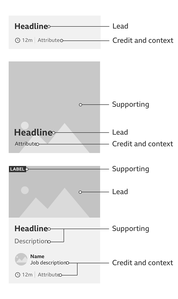
Lead: The principle of leading something is when there is a need to make a statement with that element. This might be through a headline or quote. But a promo can also lead with an image if it's felt that this is a better way to grab people's attention.
Supporting: Supporting elements can be paired up with a statement, helping to add context around it. For example, you might want to pair up a headline with an image or descriptive text. Or if you have led with an image you might want to pair this up with a headline or quote.
More than one supporting element can be used with a statement. For example, adding descriptive text and a label to signify the importance of a promo. But you might also want to add a 'play' icon to show that there is video content.
Credit and context: Once we have made the main bulk of the promo, we can add more elements to help place the promo in context. This can be in the form of:
- Editorial contributors to credit who made the content
- Metadata to help people understand when and what else is involved
- Related links to support this content with more depth or insight
Rules
The examples shown so far are based on how to construct a simple promo. You can create different types depending on where they will live and what they promote. There are principles to follow in ordering the elements but also rules when using or combining certain elements.
- Labels
- Indicating media
- Headline and text treatment
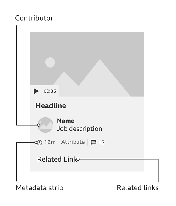
- Contributor
- Metadata strip
- Related links
Labels
A label is a temporary indicator used to attract attention to a piece of content. It's letting you know why you are seeing this. Typical uses are:
- State: To show where a piece of content is within the contents lifecycle, e.g. if a piece of content is currently in progress or due to expire. This is in place of or with a progress bar.
- Editorial: To show that there's something special about that content i.e. 'new' or 'exclusive'.
Indicating media
If an icon is needed to show what kind of media to expect when you go through to the content, this sits aligned to the bottom-left of an image or text it is supporting.
If the promo leads to an audio or video player page it should follow the audio and video guidelines.
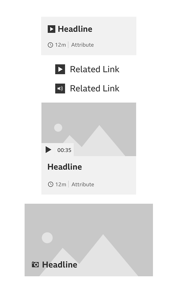
The sizing of headlines depends on the size of the promo and the branding of the products. Remember to follow the typography guideline.
Where the headline acts as a link for the promo, this should be displayed as bold weight. Where it isn't a link, these should be regular weight.
Contributor
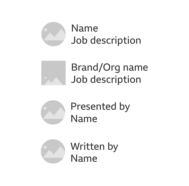
A contributor is used to credit content to a person or an organisation/brand. Where a person is a contributor the image should be a circle. Where a brand or an organisation is a contributor, the image should be square. The format of a contributor is generally:
- Name of person or organisation
- Job description
It's different when we need to be specific around a contributor's role in creating the content. In which case it follows the format:
- Written by/presented by
- Name of person or organisation
In both cases where the name is a link, this must be displayed in a bold weight.
Metadata strip
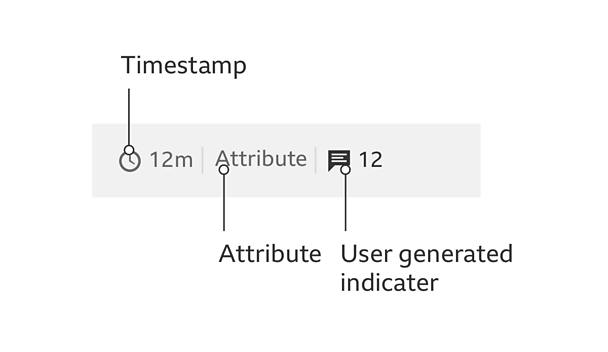
Not everything in the metadata strip needs to be shown. When they are, they are separated by a 1px-wide keyline with a height that is tied to the text line height. They must be shown in this order:
- Timestamp
- Attribute
- User generated indicator
Items here must also be in sentence case. There is an exception for attributes when it is part of a brand that uses uppercase, e.g. Â鶹ԼĹÄ ONE.
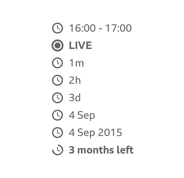
Time stamp: The use of a time stamp lets people know how old something is. This might be when or how long ago it first appeared. It could also show if something is currently LIVE or when it will be shown. When the content is LIVE the colour of the LIVE pulse and LIVE text can be changed to take on your products colour.
Attribute: An attribution is used to show a particular brand, product or source as a place of origin for the content.
Attributions shouldn't be longer than one line.
Where the attribute is a link, this needs to look different to other text. These must be in a different colour from body text and in a regular body weight to distinguish it from other text. If the attribute isn't a link, this is to be grey.
User generated indicator: User generated indicators are used when we need to show how popular something is or how many comments or ratings there are. This follows the format of icon then counter.

Related Links
When related links are needed, these must be left aligned and separate from the content with a divider. An icon may be used to help show what type of content is in the onward journey and this must sit to the left of the link.
Accessibility
When creating a tab order for the different parts of the promo, remember to put the headline before the image or audio visual. This is so screen reader users get the context before the image alt tag.
- Where appropriate, promos can use the toolbar from the cards pattern
- See card guidelines for more information
- Images should be full bleed and where possible use a 16:9 ratio
- Promo typography is based on the four type hierarchies in the typography guidelines
- Different coloured backgrounds can be used as needed by the product
Variations
Cards
Promos can look like cards when we add a toolbar to it but the difference between them is down to the content it holds. If you have to go somewhere else to get the content then this is a promo.
If the content can be consumed there and then and you don't have to go anywhere else, then this is a card.
See the card guidelines for more information around cards and the toolbar.


