Please read the Licensing terms before you download this content.
Overview

How it works
Account in apps covers two separate modules - the account menu module and the account settings module. Here's how they work:
'Sign in and register' CTAs
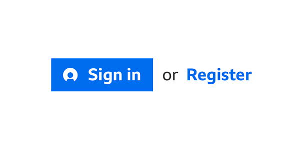
Both modules include the 'sign in or register' Call To Action (CTA). The 'sign in' button is always on the left accompanied by the words 'or register'. 'Register' is the CTA and is always written in bold text. The 'sign in' text will always appear with the 'signed out' icon sitting to its left.
Please see the 'sign in or register' CTA's download assets pack for information on the colour and styling of these buttons.
Account menu module
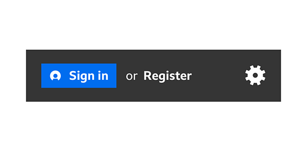
The account menu module always sits at the top of the app menu. Its height should be the same as the app bar height on their respective platforms. It spans the full width of the menu.
It also includes the GEL 'settings' cog icon. This sits on the far right of the menu. Selecting this takes you to the settings screen, where you'll have access to account settings and app settings.
Account menu module - signed out
The signed out version contains the 'sign in and register' CTAs. Selecting 'sign in' or 'register' takes you to the responsive account pages to allow sign in. When you've returned to the app you'll see the 'signed in' version of the account in apps module.
Note
Please see the settings guideline for more information around; the hierarchy of available settings, recommendations on how to group settings and also to see which settings are optional or mandatory.
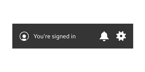
Account menu module - signed in
The signed in version contains the 'signed in' account icon (which you can't select). It'll also includes the display name or text saying 'you're signed in' if there's no display name available. The notification bell also becomes available at this stage for pan-Â鶹ԼĹÄ notifications.
Account settings module
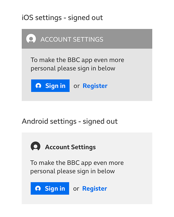
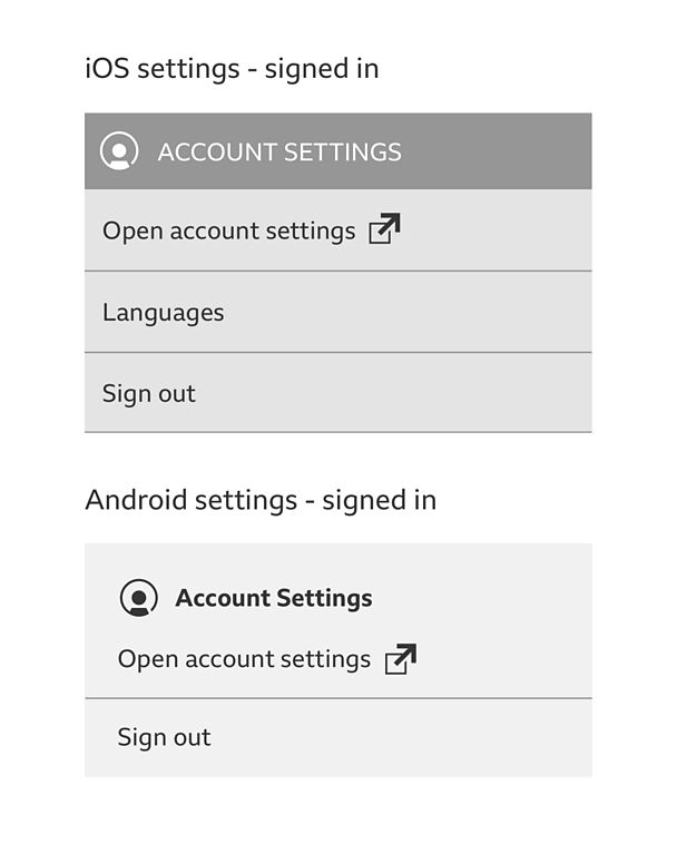
The account settings module always sits at the top of the settings screen, just above the app settings. It includes the title bar of account settings, which also includes either the 'signed in' or 'signed out' icon (depending on whether you come to the screen signed in or signed out).
On iOS the account settings module is visually separated from app settings by clear titles bars. On Android we follow the Material design pattern of using a full break between the module and the app settings below.

Account settings module - signed out
The 'signed out' version contains the 'sign in or register' CTAs. It also includes a maximum two lines of upsell copy (to be written by product) to describe the benefits of signing in or registering for a Â鶹ԼĹÄ account.
Selecting 'sign in or register' CTA takes you to the responsive account pages within apps to allow sign in or registration. When you're returned to the app, you'll see the 'signed in' version of the Â鶹ԼĹÄ account menu module.
Account settings module - signed in
The signed in version of the account module contains the same title bar as above but uses the 'signed in' icon instead. In place of the CTAs we now see a series of available options:
- A mandatory text link to your account settings (this will take them to their responsive account profile page)
- Any settings that are stored under account but not yet available on your account profile page (currently only languages)
- A link to sign out
Signing out journey
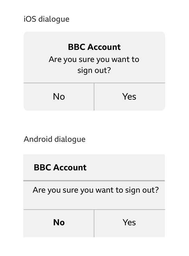
If someone chooses to sign out they will see either:
Non mandatory sign in app
This will show a native dialog box asking if you are sure you want to sign out. Selecting 'yes' will return you to the 'settings' screen in its 'signed out' state.
Mandatory sign in apps
This will show a native dialog box asking if you are sure you want to sign out. Selecting 'yes' will take you back to the 'sign in or register' screen of onboarding.
Signing in journey
Signing in from a menu
After you have completed the sign in process, you are taken back to the menu in it's open state. The menu and settings are changed to their 'signed in' state.
Signing in from in-page upsell
After you have completed the 'sign in' process, you are taken back to 'page to return to'. A confirmation message animates down to confirm sign in or registration is successful. The menu and settings are changed to their 'signed in' states.
Rules
Account menu module
- Background colour of the modules will be defined by the product
- Fonts should be the system font or Â鶹ԼĹÄ Reith
- The display name should always be shown if available
- The display name should truncate if it's longer than twenty characters
- If no display name is available in the signed in version of the account menu module, please use 'you're signed in'
Account settings module
- A white or black background can be used for the account settings module
- Brand colour can be used on toggles/switches/text boxes and titles
- Use native toggles and switches
- Use GEL recommended font sizes
- Use the GEL 'external link' icon to accompany the link 'open account settings'
Signing out journey
- Native dialogs: For mandatory sign in apps, 'no' should be in bold to encourage people to stay signed in.
Variations
Pull-down menu
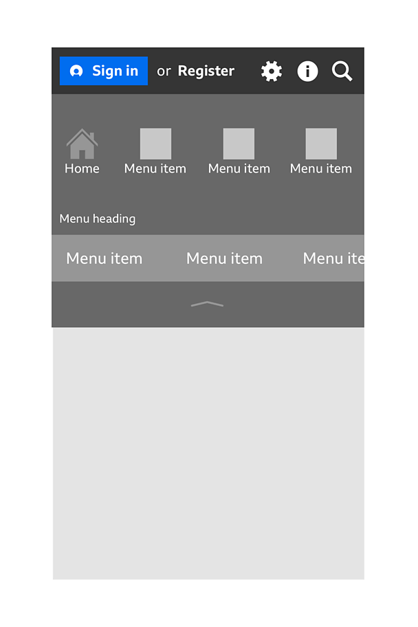
The account module can also be used in apps with a pull-down menu. When used in the pull-down menu it's recommended that the GEL 'info' icon sits to the right of the GEL 'settings' icon. This allows you to separate the settings from the information about your app.
Please see the downloadable assets for the specs.
Languages
For Irish, Welsh and Scottish 'you're signed in' has been shortened to 'signed in'. These are the translations:
- Irish - ShĂnigh tĂş isteach
- Welsh - Wedi mewngofnodi
- Scottish - Log thu a-steach
Licensing
These assets are available for download on the following licence terms:
You can:
- Download the assets and use them free of charge;
- Use the assets without attribution; and
- Modify or alter the assets and edit them as you like.
You can't:
- Use the assets in a way that would bring the Â鶹ԼĹÄ into disrepute;
- Make available the assets so that they can be downloaded by others;
- Sell the assets to other people or package the assets with others that are for sale;
- Take payment from others to access the assets (including putting them behind a paywall);
- Use the assets as part of a service that you are charging money for; or
- Imply association with or endorsement from the Â鶹ԼĹÄ by using the assets.
Disclaimer: The assets are offered as is and the Â鶹ԼĹÄ is not responsible for anything that happens if you use them.


