Please read the Licensing terms before you download this content.
Overview
How it works
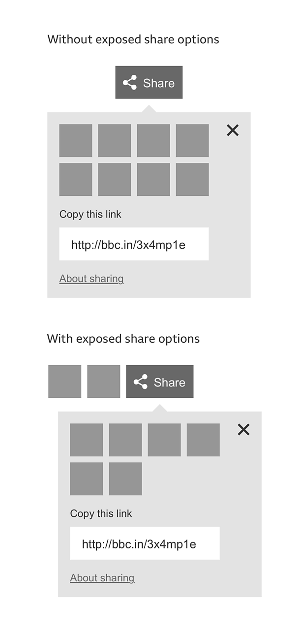
The share tool consists of a 'share' button and share options which can be exposed either beside the 'share' button or displayed inside an information panel.
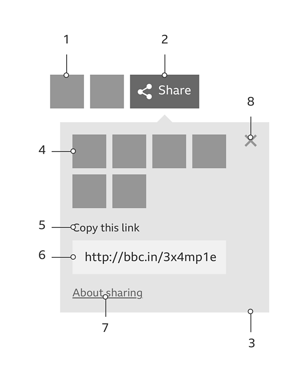
The share tool is made up of the following parts:
- Exposed 'share' option
- 'Share' button
- Information panel
- 'Share' option
- 'Copy this link' label
- Shareable link
- 'About sharing' link
- 'Close' button
The 'share' button
The 'share' button consists of the GEL 'share' icon and a label. When someone selects the 'share' button, the information panel is revealed, allowing them to select a 'share' option.
Note
iOS and Android apps use the native 'share' icons for their respective operating systems. Please see the content utilities pattern for more information.
The 'share' options
'Share' options represent various social networks and other ways in which things can be shared.
By default, share options are displayed inside the information panel. However, you can choose to expose 'share' options to prioritise them.
A maximum of eight exposed 'share' options allow the pattern to make use of available space, while ensuring the exposed options remain effective.
The information panel
The information panel enables us to display more share options than space might otherwise allow.
The information panel contains the following:
- The 'share' options
- The shareable link
- 'About sharing' link
- A 'close' button
Exposed 'share' options are not duplicated by appearing inside the information panel. The information panel only contains 'share' options that are not exposed.
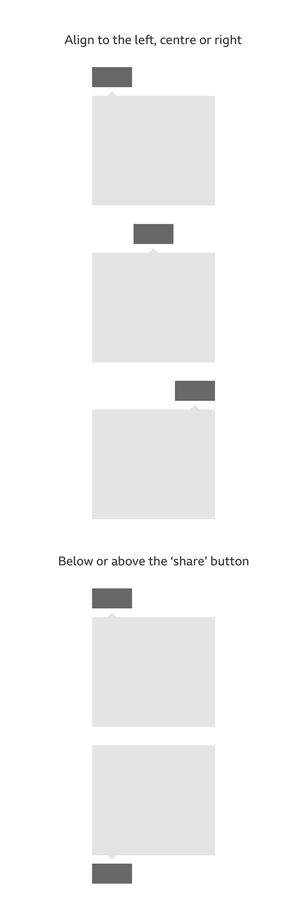
The information panel should open above or below the 'share' button, depending on the share tool's location inside the viewport. It can be aligned to the left, centre or right of the 'share' button. There is no default preference as to how you present the information panel.
Where and when to display the share tool
The share tool can be used in a variety of situations:
- Page sharing - When sharing the whole page (e.g. an article) 'share' options should be displayed at the top and bottom of a page. The bottom of the page has space to expose more 'share' options. For even more visibility of the share tool, a fixed banner would allow the share options to be exposed when the top or bottom of the page are not within view.
- State sharing - At the end state of a quiz (i.e. the results) share options could appear prominently.
- **Granular sharing **- When sharing an individual image, live stream post, or piece of granular content, 'share' options could appear as a single icon, with the remainder inside the information panel.

Rules
Responsive behaviour
How the share tool responds to the width of the space it's in is up to you.
For example, you can choose to have a fixed pattern across all breakpoints, or a progressive reveal of exposed 'share' options.
Keeping a consistent look and feel
To maintain a consistent look and feel, and ensure the share tool is always easily found, it's important to stick to the guidelines. Unless stated in the variations section, there should be no further customisation of the share tool.
For guidance on consistency, please see this patterns downloadable assets.
Where to place the share tool
The share tool is designed to fit into any space, whether it's the full-width of a page, a single column or within an explicit container (e.g. a card).
How to signpost the share tool
The share tool is designed to work with and without signposting.
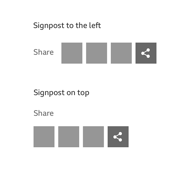
If you choose to signpost the share tool, it can be given a title, either to the left or on top of the 'share' options.
When to label the 'share' button
Unless space is limited, for example on smaller breakpoints, we recommend you include the 'share' button label as it increases the number of users sharing content.
However, if you choose to signpost the share tool, the 'share' button label should be hidden. This is to avoid repeating the message.
Where to place the shareable link
By default, the shareable link is displayed inside the information panel, however you can choose to expose the shareable link to prioritise it over other 'share' options.
Do
- Replace the shareable link header with a 'link' icon inside the shareable link field. (Be sure to use icons with the correct text label, visible or programmatic. Icons should appear to the left of their respective labels).
- Display the exposed shareable link on a new line, so as not to conflict with the flow of exposed 'share' options.
- Make the width of the shareable link field the same as the combined width of the exposed 'share' options.
- Signpost the share tool.
Don't
- Use the information panel to display the 'about sharing' link on its own, when the shareable link and all other 'share' options are exposed.
- Use the 'share' button when you're not using the information panel.
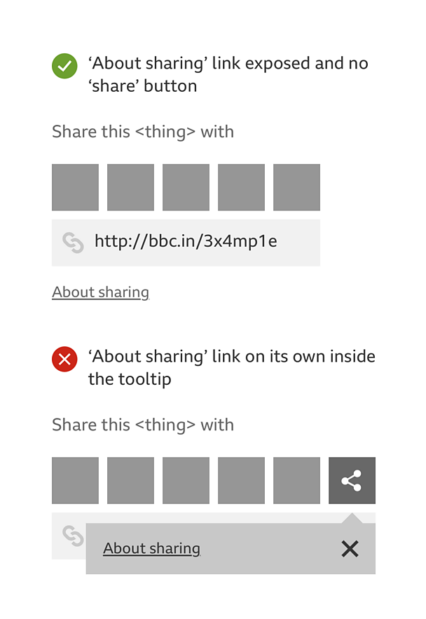
Variations
Colour
There are three colour variations to choose from:
- White, blocks - All the icons are white, as well as the 'share' button label. The 'share' button and each 'share' option is styled as a button, with a background colour that is determined by the brand identity of the social network. The 'share' button background is green.
- Colour, no blocks (suitable for light backgrounds) - The colours of the 'share' option icons are determined by the brand identity of the social network. The 'share' button icon and label are green.
- White, no blocks (suitable for dark backgrounds) - All the icons are white, as well as the 'share' button label.
For guidance on colour variations, please see this patterns downloadable assets.
Messaging
The 'share' button label, or signposting, should read in one of the following ways, dependant on the space available:
- Share
- Share this
- Share this <thing>;
- Share this <thing> with
<thing> should be replaced with one of the following share nouns:
- page
- article
- artist
- audio
- audio clip
- blog
- chapter
- clip
- collection
- comment
- episode
- event
- guide
- image
- music piece
- picture
- playlist
- post
- presenter
- programme
- recipe
- result
- station
- step
- story
- track
- video
You are also free to use a noun that isn't in the list above, providing it best describes the content being shared. Its adoption across the Â鶹ԼĹÄ should be encouraged as to maintain consistency.
Licensing
These assets are available for download on the following licence terms:
You can:
- Download the assets and use them free of charge;
- Use the assets without attribution; and
- Modify or alter the assets and edit them as you like.
You can't:
- Use the assets in a way that would bring the Â鶹ԼĹÄ into disrepute;
- Make available the assets so that they can be downloaded by others;
- Sell the assets to other people or package the assets with others that are for sale;
- Take payment from others to access the assets (including putting them behind a paywall);
- Use the assets as part of a service that you are charging money for; or
- Imply association with or endorsement from the Â鶹ԼĹÄ by using the assets.
Disclaimer: The assets are offered as is and the Â鶹ԼĹÄ is not responsible for anything that happens if you use them.


