Overview

How it works
A bottom navigation bar contains three to five items, each representing a different top-level destination on the app. Each item is composed of a text label or an icon, or both.
When one of the items on the bottom navigation is tapped the user is taken to the top-level destination associated with that item.
A bottom navigation makes it easier to access the key areas of the app by keeping the navigation visible upon launching the app and is placed in an area of the screen that users can comfortably reach on a handheld mobile device.
Positioning
A bottom navigation is positioned at the bottom of the app screen, in full width. A bottom navigation is always persistent on all first level sections of the app and maybe persistent on further sections of the app (eg: content pages) to allow for quick navigation to the app's key destinations.

Caution: Using a bottom navigation with tabs may create confusion in how they relate to the content displayed on the screen. While tabs are used to separate content into smaller groups of related information, a bottom navigation allows for navigation between distinct and unrelated areas of the app.
States
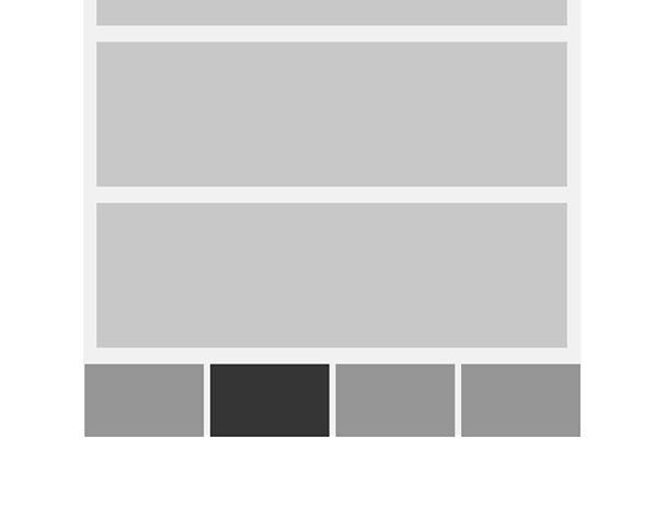
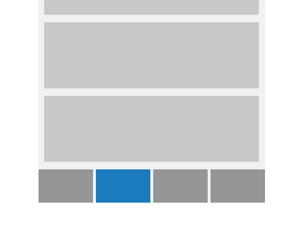
Bottom navigation items have a selected and an unselected state. Whenever the navigation is visible there's always one single item selected.

Items
Each item on the bottom navigation represents a different top-level destination on the app. Bottom navigation destinations should be of equal importance.
Navigation
The behaviour of the bottom navigation can differ between Android and iOS:
Android: when a new item is selected the user is taken to that top-level destination. Scroll position, in-line search or any other user interaction are not retained.
iOS: when a new item is selected the user is taken to that top-level destination and previous interactions are retained, eg: if the user had visited that section of the app the scroll position would be retained.
However the default platform specific behaviour can be overridden to improve the user experience. To find out more about designing for mobile and tablet devices, read our guide on how to design for touch.
Use with other patterns
Be cautious when using a bottom navigation in conjunction with another primary navigation pattern, as doing so can make the app's structure unclear, and lead to confusion for users trying to navigate the app.
The side drawer menu guideline includes a variation that covers it's use alongside a bottom navigation. Read the side drawer menu guidelineto learn about it.
Rules
- Should be used on mobile or tablet only
- A bottom navigation should have between three to five items
- There must be one item that's always selected
- The items on the nav bar are in a fixed position. They don't scroll or move horizontally
- Text labels should be short, meaningful descriptions of the destination they represent. They should make sense when read in isolation (for example, by a screen reader)
- Some languages may have single words that are long and hard to fit into the nav bar. It is ok to shorten them using full stops but make sure the description is still clear
- Each item should have similarly sized icons and use the same font size
- On mobile landscape or tablet, the bottom navigation should fill the whole width of the screen but the items can keep the same spacing used in portrait mode instead of being equally distributed on the navigation bar. Alternatively the text label and icon for each item can be placed side by side instead of stacked vertically
Accessibility
Visual considerations
- There must be a clear colour contrast between the selected and the unselected items
- A hover state must have a clear colour contrast with both the selected and unselected tabs
- Make sure the colour of the text contrasts well with the backgrounds of the navigation bar
To find out more about hit zones, read our guide on how to design for touch.
To find out more about accessibility 'dos and don'ts', read our guide on how to design for accessibility.
Variations
Bottom navigation on Â鶹ԼĹÄ world service sites
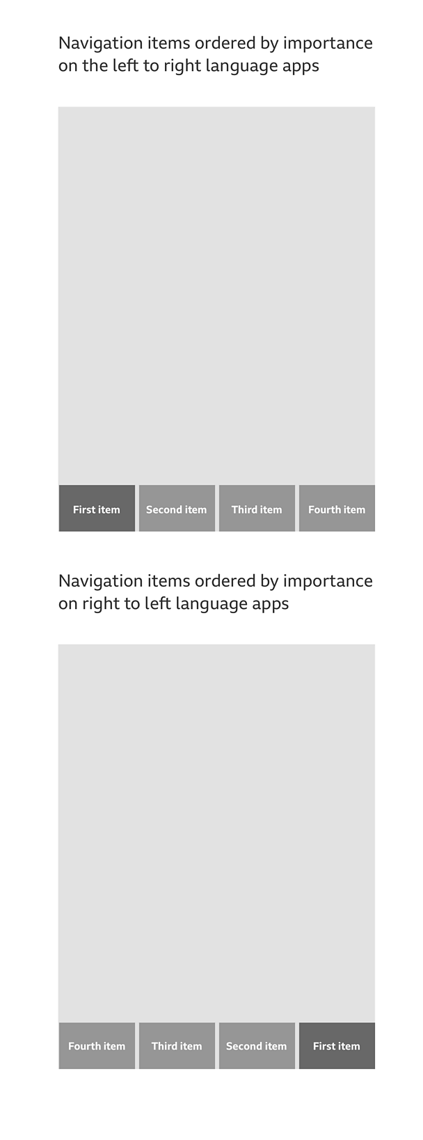
Some of the Â鶹ԼĹÄ's world service sites are designed for languages that are read from right to left. These include Arabic, Urdu and Persian. If you want to use a bottom navigation on any of these sites, you must make sure the items order begins from the right and the content is aligned in the same direction.

Pattern in action
This pattern is currently being used by the Â鶹ԼĹÄ News, Â鶹ԼĹÄ Sport, Â鶹ԼĹÄ Sounds and Â鶹ԼĹÄ Learning English apps, available here:
/
/
/
/
/


