Overview
How it works
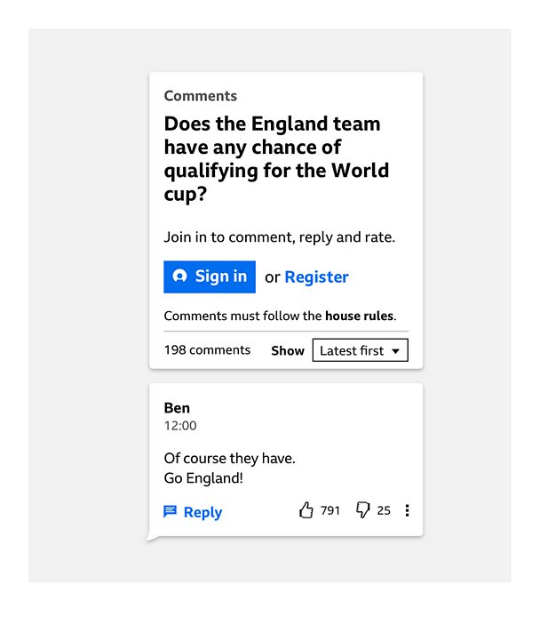
The comments module consists of a header and posted comments. The header can contain several elements:
- A label describing the type of participation (Q&A, comments, chatbot etc)
- An engaging call-to-action title to focus participation on a topic
- Combined filters and sorting button
- The 'sign in or register' call to action (CTA)
- A text entry box
Signed out
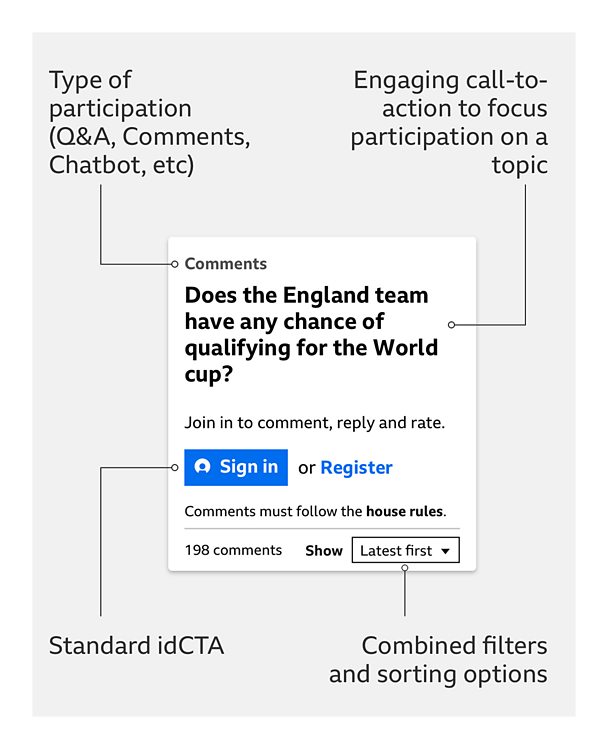
Users need to be signed in to their Â鶹ԼĹÄ account before they can interact with the comments module. We use the standard 'sign in or register' CTA when the user is in a signed-out state.
Signed in
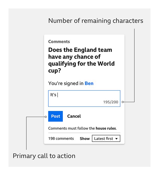
When the user is signed in to their Â鶹ԼĹÄ account, the call to action changes to a text entry field.

Text entry
When typing a comment, users can see the number of characters left and a 'Post' primary CTA is revealed.
Successfully posted comment
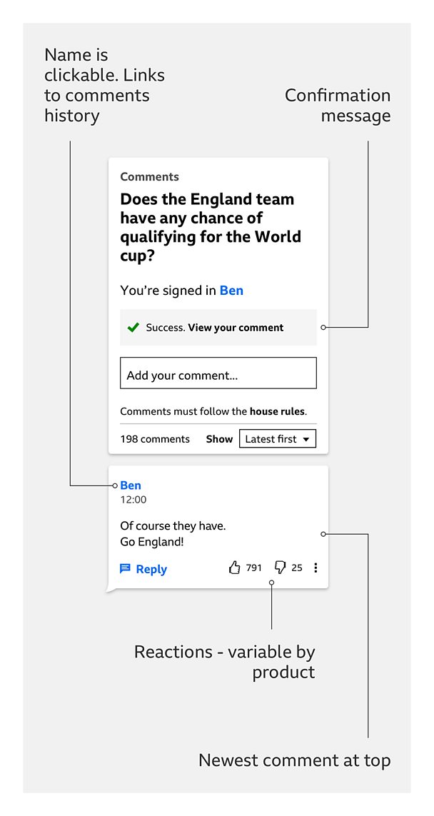
Once a comment has been posted, a confirmation appears above the text entry field. This message changes depending on whether it is pre-moderated or post-moderated.
By default, comments are below the header, and listed newest to oldest.
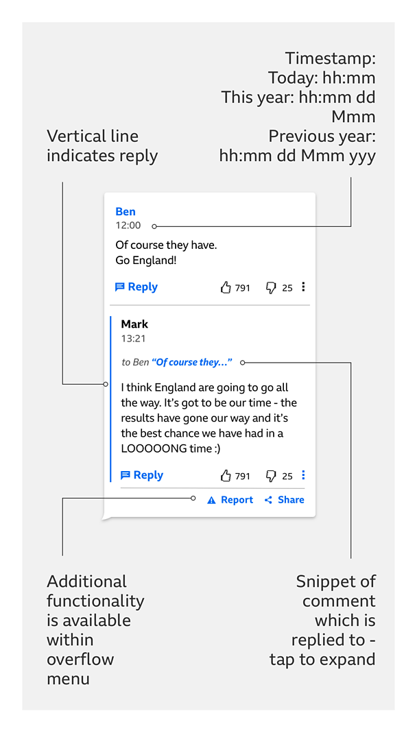
Replies/timestamps/overflow menu
The clearest way to show the order of comments is by using:
- Posted today: a full hour and minute timestamp
- Posted this year (but not today): as above, and add the day and month
- Last year or before: as above, and add the year
To indicate when a comment is a reply, there are vertical lines within the comment, and a snippet of the comment which prompted the reply.
Depending on the product, comments may have reactions.
The overflow menu holds secondary functionality, like reporting or sharing a comment. Our research suggested users understand it as the place to go for more options.
Points to note
Under 13s and 13-16s
Sign-in related elements of the module vary for under 13s and 13-16s, while comment related elements vary for under 16s.
Different types of participation in an article
There are times when a combination of participation types needs to be used in an article. But always consider if it needs more than one type, and be careful to avoid situations that might confuse the user, like having a chatbot and comments next to each other.
Accessibility
Typography
- As the comments experience is text heavy, GEL typography guidelines should be adhered to
Tabbing order
- The tabbing order is always left to right
Screen readers
- Comments are fully accessible if you're using a screen reader
- When navigation focus is on the comment entry box, the remaining characters are announced
- When navigation is on the "cancel" button, "clear your comment and cancel" is announced
- When navigation is on "reply," "your reply to [displayname]" is announced
Pattern in action
This pattern is currently being used by the Blue Peter Fan Club.


