Designing the Connected Red Button

Robin Gibson
Senior UX Designer
Hi I'm Robin Gibson, a senior in �鶹Լ�� Future Media and worked on �鶹Լ�� .
Connected Red Button reinvents traditional Red Button bringing �鶹Լ�� online to the living room.
The service launched on platforms in December 2012 and the �鶹Լ�� will be rolling it out to other connected TVs during 2013.
We thought now would be a good time to share some of the thinking behind the design approach.
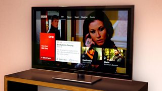
The live service
The project began in mid 2011 when the design team received the brief for a reimagining of the Red Button service for .
The vision was to provide the foundation for interactivity around the �鶹Լ��’s television channels and to set the benchmark for delivering internet driven content across broadcast.
The brief was to be both progressive yet instantly familiar, continuing to embrace the features that make traditional Red Button a successful service today.
Background
With the brief in hand we began a period of research into audience needs whilst examining existing products and interaction patterns on TV.
We obviously knew a great deal about current Red Button usage, but what did users expect from a future service?
Commissioning audience research enabled us to define core principles that sit at the very heart of Connected Red Button.
These are:
• Radical simplicity
• Seamless, satisfying journeys between broadcast and on demand services
• A shared, safe experience
• Exploratory
• Personal
These principles would act as our design compass, helping to keep the team on track throughout the project as we strove to match then exceed audience expectations.
A product vision, a whole batch of research, design principles, mood boards, personas and user requirements meant we where ready to start design exploration.
Whilst the current suite of �鶹Լ�� iPTV applications (, and ) certainly gave us a great foundation for the Connected Red Button service, the challenge before us was how could we offer users a gateway between these apps and bring the world of �鶹Լ�� iPTV under one umbrella?
Retaining the broadcast
Very loose sketches (or scamps) of layouts where thrown around, sticky notes and paper prototypes littered desks and walls. Ideas where dismissed as quickly as they where drawn up.
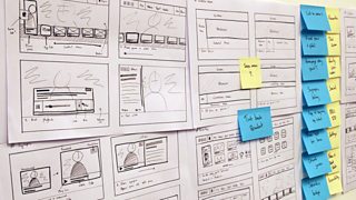
Finding space on the design wall was a challenge in itself
The decision to retain the full screen broadcast in the background of the UI (User Interface) rather than a more conventional quarter screen view (where the broadcast is minimized into a small box) informed every aspect of the design.
The positioning of the content stream, the synopsis rollover and even colour pallete where all informed by this decision.
The retention of full-screen broadcast meant the UI needed to not distract from the background video, presenting the team with a number of challenges.
This left us with a precarious balancing act of trying to reserve as much real estate on the screen as possible for the broadcast whilst still trying to display the Red Button UI in a highly visible manner.
No easy task when minimum font sizes are double those found online.
Global Navigation
Early on in the project we knew the desire of the �鶹Լ��’s was to maintain the across mobile and desktop devices and transfer it to the television experience.
This means that regardless of the device being used to access �鶹Լ�� content a product will feel inherently familiar to the user.
This led us to divide the UI into two paradigms: global and contextual.
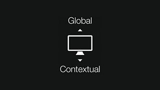
Simplicity remains at the core of Connected Red Button navigation
Global Navigation would sit at the top of the screen while contextual navigation is displayed in a single stream of content at the bottom displayed as selectable images. A large portion of the screen is thereby reserved for broadcast.
At the left of each stream of content we have a menu block that took inspiration from the visual language of smart phone applications.
These menus included ‘launcher’ items that load dedicated �鶹Լ�� full-screen applications (including iPlayer, News and Sport) enabling users to discover a range of additional content.
Efficient design
Constraints are the foundations of great design and having such a relatively small portion of the screen to deliver content forced us to be efficient in a way that might not have been the case had we had the luxury of a full screen interface.
Navigation itself, restricted to the directional buttons of a standard TV remote control (we ruled out the use of colour keys) meant that every journey needed to be purposeful.
Font sizes on television need to be much larger than on other devices and combined with limited screen real estate this meant every bit of space mattered.
Initial explorations emphasized that to fit a meaningful amount of additional content onscreen required us to truncate titles and headlines, even before considering what would happen to the programme synopsis.
We had an aspiration to have the synopsis at the top layer but this was proving problematic. This is because we always felt this information could help inform the users journey, especially as they could potentially be moving away from a programme that they are currently watching.
We therefore decided to scale the highlighted item and use this enlarged area to present the synopsis.
This improved the users focus, provided enough screen real estate to display full titles for the vast majority of content and gave us an opportunity to reveal the synopsis over the image whilst not infringing too much onto the underlying broadcast.
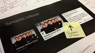
The synopsis rollover was to become one of the defining features of the Connected Red Button
Test, test and test again
Test early, test often is a widely used UX principle. Observing people interacting with your interface is invaluable and also means that issues become apparent very quickly and enable designs to be rapidly redrafted in response.
The prototypes we tested were designed and built to simulate the true experience of using the software on the target device, representing frame-rates and loading times.
The sessions themselves took place in a mock living room with a high fidelity prototype running on a TV. All users interacted with the TV in the normal way using a remote control.
Test participants were matched to a range of profiles representative of our audience mix.
We used a range of testing techniques including , formal task-based testing in the lab and wider hall testing (often with several hundred users) in order to determine the value and usability of each design phase.
Typically sessions were broken up into three parts: explore, task completion and reflective feedback ensuring we covered off all usability questions.
The UX team was supported by the who provided expert assistance in designing task based questionnaires, recruitment, facilitation and delivery of testing sessions. They also audited the product against internal accessibility criteria.
Although extremely positive, the sessions highlighted a major issue with the discovery of the underlying applications that the Connected Red Button links to.
The visual treatment of the application launcher at the beginning of the stream was being mistaken for a heading therefore users didn’t realize this was a clickable item, missing the onward journeys into the applications.
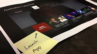
Early designs featured a smart phone esq visual link to the underlying applications
This part of the interface was certainly the most problematic. Numerous versions were tested and failed. This may be because the concept of an app wasn’t as widely understood in a television context as it is in say a smart phone.
We ripped up that section and started afresh, introducing a �鶹Լ�� branded stream heading instead (i.e. �鶹Լ�� iPlayer, �鶹Լ�� Sport etc) alongside a distinct link to the application.
The concept of filtering the stream came out of this approach as user feedback led us to believe that there was a convenience in retaining the background broadcast whilst browsing through content.
The shape of the project evolved and vertical navigation was introduced to enable us to filter the stream by category.
As a team we did have some initial reservations about whether we where adding a layer of complexity to the product that had the potential to confuse our less tech savvy audience, but the beauty of testing allows us to try out such concepts before they see the light of day.
The sessions went remarkably well, better than we anticipated. Users were able to access the underlying apps as well as browsing a large volume of content at the Red Button level.
The design was beginning to function in the way it was intended.
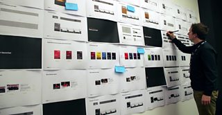
Documenting and iterating designs based on user research
Beyond Connected Red Button
2013 will see a series of new features being released on Connected Red Button as well as scaling up the service to be available on a wider range of connected TVs.
We are constantly looking to make improvements to the service as well as exploring new concepts such as and how we can expand on the foundations of Connected Red Button to bring programmes to life on multiple screens.
The future of Connected Red Button is genuinely very exciting.
Thank you for taking the time to read this blog and I hope you enjoy using the service now and in the future.
Please let us know what you think of the design by leaving a comment below.
Robin Gibson is a senior user experience designer in �鶹Լ�� Future Media. This post is a collaboration between Robin and fellow senior user experience designer Wez Elliot.