�鶹Լ�� iWonder interactive guides: navigation and user experience

Nick Horrell
Senior Product Manager
Tagged with:
I’m Nick Horrell and I’m the Senior Product Manager responsible for the delivery of 's new interactive guides.
As Andy Pipes has already mentioned in his this format aims to deliver “sit-forward” experiences, across multiple devices and in a reusable manner. These are three key parts of our vision.
I’m going to outline how we set about achieving these in a bit more detail, taking our concepts to first release and some of the thought processes involved, and highlighting some of the new features since launch.
Navigating a responsive site
We started out with the structure of a guide. It had to be completely scalable, both in user experience and the way we wrote the code. Our first 3 fortnightly sprints (working under the ) were focussed largely on responsive navigation and how each step of the guide would be displayed to the user.
Our first concept was expandable sections for mobile/tablet. But after extensive user feature testing, we saw that people were missing parts and didn’t feel compelled to work through the content. We explored having persistent next and previous buttons which would take you straight to the next step in the guide, but users were unsure of exactly what it was trying to do (and if you were at the bottom of a step with the next one in view, it was rather useless!).
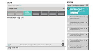
Early concepts of the guide navigation
The vertical navigation bar we decided on for mobile and tablet was born out of the fact that users wanted to be able to orientate themselves within the guide. We have tried to ensure that all required navigation is available at all times without chewing up too much space on the screen.
A very conscious decision was made to include all the steps under the same URL, rather than taking you to a new page each time. This, we feel, gives a greater sense of continuity to the content.
During the conceptual stages, we explored horizontal versus vertical navigation. Both tested quite well; we eventually opted for vertical stacking of the steps, as that’s the expected behaviour when scrolling on devices. But we recognised the fact that desktop displays are typically landscape, so opted for horizontal progression on the navigator, which I think is quite a nice juxtaposition.
This structure is consistent across all devices, with the exception of the vertical navigator on mobile/tablet. This is particularly important as we detect views based on screen width breakpoints, rather than device model. Therefore a user could very well see different layouts on their device when rotating between portrait and landscape.
Delivering the content in 'steps'
Our format is capable of handling between 3 and 8 steps, always including the introduction at the top and the “Where next?” panel at the end.
Steps are designed to be "plug and play" meaning that the producer can edit them individually or reorder them as they see fit. All the styling and colouring is also taken care of automatically, making this a very quick process.
Each step automatically takes the colours and styling of the chosen palette
We currently have a number of different step types including Narrative (text-led with supporting AV, quotes or images), Static Infographic, Media (large AV player), Question (multiple choice and answer) and Slideshow (multiple images) with more on the way.
Colour palettes
If you’ve read through more than one of the WW1 interactive guides, you may have noticed different colour schemes. There are currently 6 different palettes available to the �鶹Լ�� editorial teams producing guides. We have developed a scalable system, which substitutes numbers for hexadecimal values. Each step in a guide has a progressively lighter base colour, which are matched in a matrix depending on how many steps there are (see images below).
Each palette has a fixed highlight colour (#9 and #6 in the example below), which is applied to the play buttons and at various other points.
The way this has been implemented means that should any new colour schemes be required, we only need to apply the hexadecimal values to each # number in the code, re-colour our step number sprites, and we’re away.
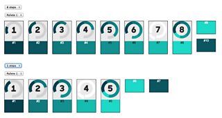
A colour palette with defined hexadecimal values based on an 8-step and a 5-step guide
Doing, not just viewing
Our guides aim to be interactive and playful, breaking the mould of traditional static content.
Our recently introduced Activity step type goes some way towards achieving this. This step is effectively an empty element that pulls in HTML5 activities created by our independent partners. We have created an accompanying Software Development Kit (SDK) along with a test harness, allowing our partners to build new activities and submit to us for instant upload.
We expect this to greatly reduce the cost and time required to develop exciting and cutting edge interactive content. The production teams can focus on the editorial brief, without having to get caught up in the technical delivery and constraints.
A clickable activity contained in the new Activity Step
We anticipate that certain activities will prove more popular than others and there will undoubtedly be a demand for more and more instances to be created. We will look to “productise” the most successful ones – they will get their own step type and allow producers to create them in the space of minutes. They become as simple as adding some text and images, and hitting the publish button. Creating interactive content at this pace cannot be understated.
We are already doing this with activity types that the �鶹Լ�� has the technical systems to deliver. We are working closely with various �鶹Լ�� Online teams to incorporate existing technology such as iVote (behind the Strictly Come Dancing voting) and our in-house quiz engine, ACME. Keep your eyes peeled for these over the coming months.
So what’s next?
The examples I’ve given above are just some of the issues and decisions we’ve had to overcome in creating the interactive guides format. From here on it’s all about tweaking as we go; things are rarely perfect right from day one and we will keep a close eye on behaviours and feedback to see how we can make guides even more user-friendly and enjoyable.
Last week saw the release of our newest feature - a language picker, which allows users to change navigational elements on the page to their chosen language, including English, Welsh, Scottish Gaelic and Irish Gaelic.
This has paved the way for the first guide .
It is one of many new features that will open up the �鶹Լ�� iWonder experience to an even wider audience.
Following on from that, our focus will be to continue enhancing the guide experience and also explore how people can find more of the content they want from �鶹Լ�� iWonder.
If you have any comments or feedback on the �鶹Լ�� iWonder interactive guides, I would love to hear them.
Nick Horrell is Senior Product Manager, �鶹Լ�� iWonder