
Over the last six months, I have been working on some internal systems that the �鶹Լ�� uses for curating and editing some of its content online. Based on this experience, I have realised that a Lean UX approach for a complex media organisation like the �鶹Լ�� can be extremely beneficial. I realised this first working on a system called .
iSite is a web platform used by �鶹Լ�� editorial teams for creating and publishing content across web pages, apps and several different channels. I’m the��User Experience designer on the iSite team, and the challenges we face are:
- Different groups of people using the tool with very different needs, purposes, and sometimes total detachment from tangible outputs. Some teams cannot know with certainty where the content they are creating will appear.
- Certain teams have very complex content governance policies and multichannel outputs, while other teams just need to push some content out on the web – added to this the fact they are often spread across different locations.
��
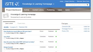
iSite project dashboard.
A couple of months ago, the product began to be adopted by a growing user base with quickly evolving demands, and we realised that we needed a faster approach for validating our design hypothesis. What we needed was to address specific needs, in harmony with the wider vision of the product.
Together with my colleague Anoushka Ferrari, a User Experience Architect, we decided to move towards a more 'lean UX' approach, transitioning from wireframes and very detailed page views to more 'fluid' deliverables, like small ad-hoc HTML prototypes, supported by a style guide focused on single features and reusable patterns - an approach already in use in other areas of the �鶹Լ��.
But the key change came with the other two main features of the lean UX methodology: define an hypothesis and test it as quickly as possible with users. The challenge for me, the Product Manager Stephen Elson and the Business Analyst Graham Hoyle, was to test an hypothesis quickly and effectively and, at the same time, keep the focus on the main aim of the product and the big picture.
One of the risks of testing quickly is to be too focused on small iterations and lose the balance between single features and product vision. However, for iSite, we were helped by the very specific nature of our users and by a healthy culture of continuous conversation between the people working on the product (managers, analysts and developers) and its users. As iSite is internal to the �鶹Լ�� and affects the everyday work of many teams, the recruitment for usability testing, interviews, chats, has been and still is extremely easy, as we basically walk among the desks of our users every morning. We have been coming to realise that to observe people in their natural context of work, and not in usability laboratories, can be more enlightening, even if it requires a bit more hassle and 'on-the-fly' organisation – for example Skype calls for letting the team observing the session, shared screens, etc. In this way we have been able to formulate hypotheses and test them more quickly without waiting for laborious set up of lab sessions.
We also realised that the test sessions were occasions for socialising, listening and sharing our views on the product with our users. Most of them are extremely knowledgeable of the product and the organisation, so the tests became an occasion for co-designing parts of the product. Through the tests, users had their say on the features and could talk in detail about their needs. And we were able to share with them the challenges the product was (and is) facing. When designing and building iSite, we have to find a good balance between specific needs and maintainability. By discussing this, our users can relate their needs to the bigger picture, and they can be more involved than just requesting features.
��
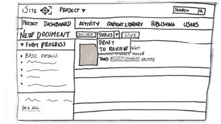
Paper sketch of iSite screen.
All of this came together when we had to deal with the management of content publishing workflow: we had to allow project admins to manage permissions on the creation and publication of single pieces of content. After listening to some key users, our hypothesis was that content permissions could be more effective and flexible in the form of a lightweight system of labelling, rooted in cloud-based software practices, rather than as expression of a linear process of being 'approved', 'sent' or ‘blocked’. Blocking was also a major issue in big teams working in shifts or needing to edit and review several times the same content, and our hypothesis was aimed at overcoming that problem.
We tested the hypothesis via sketches (and sketching together) with the teams and with key stakeholders. This helped everyone to give feedback, and, sometimes, even to adapt their workflow and accept constraints on desired features, related to time and roadmap. We are using this joined up approach as more parts of the software are developed.
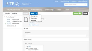
iSite screen showing save options.
At the same time, in terms of everyday work within the team, this focus on the hypothesis, together with a constant collaboration with the Product Manager, the Business Analyst and the rest of the team, helped to put under the spotlight not just the UI design solutions to be put in place, but also the motivation behind them. Given that the team uses the agile method Kanban, and that there is a huge focus (clearly visible on the team board) on the collective analysis of any single piece of work before moving to any work in progress, the discussion around design solutions, even big ones, was not being relegated to ‘spikes’ or separate design sprints. This has created space for a (that I first read about in a post from Brian Rees) and a sort of as advocated by Marty Cagan involving all the members of the team.
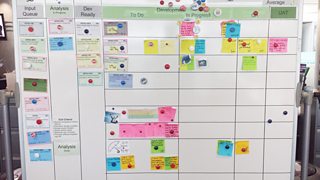
Team Kanban whiteboard.
This approach is not without practical problems, but it has been really beneficial, and having now worked on other �鶹Լ�� internal tools and systems, the advantages of the lean UX approach are even more evident to me. I have applied what I learnt on iSite, putting the focus on interaction patterns and quickly assembling ad-hoc lightweight deliverables based on the teams’ and products needs, sometimes making the product itself the only deliverable.
Looking at the wider �鶹Լ�� and at its internal systems, Lean UX looks like a powerful way of approaching new challenges. The �鶹Լ�� is a media organisation delivering experiences at all levels of content consumption, and is continuously creating hybrid pieces of media (i.e. Playlister) which use different traditional media recombined in new ways across video, audio, and archived content. The management tools for these products need to be quickly updated, changed, improved, and to include new features and possibilities, all within a sustainable approach for the �鶹Լ�� in terms of resources and speed.
Lean UX appears to be one of the answers to that, an approach to user experience and design work that can vastly and efficiently adapt to the challenging demand of the new �鶹Լ�� digital offer, and quickly put in place cross-product solutions which enforces consistency through lightweight documentation. Lean can also be useful for bringing the ‘Discovery phase’ into the everyday life of fast-moving agile teams and reduce the reliance on separate design spikes or isolated activities taking place away from the rest of the team.
That is not saying that Lean UX is a remedy that solves everything, as it has to deal with contextual challenges that need to be identified every single time, but it can certainly help. In my experience, it certainly did.
Ferdinando De Meo is a Senior User Experience Designer, �鶹Լ�� Future Media.