
Hi,
I work in the Accessibility team in���鶹Լ�� Future Media. We provide tools, training, and support to teams within the �鶹Լ�� so that they can deliver web content and applications that are accessible to disabled audiences.
Earlier this weekThis new site replaces separate mobile, tablet and desktop sites with one responsive site. In streamlining the user experience for all users we wanted to also exceed existing levels of accessibility with the current �鶹Լ�� iPlayer and, more importantly, make the site more usable for disabled users. To do this we embedded accessibility into the design and development process from the outset. This post talks through some of the headlines of how we went about doing this.
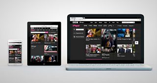
The new �鶹Լ�� iPlayer replaces mobile, tablet and desktop sites with one responsive site
It was important for us to understand what we were trying to achieve from the start as well as understand how we were going to achieve it. We ran training courses for the user experience, developer and test teams to make sure that everyone understood what their role and responsibilities were and where to find resources such as the and the
User Experience
Before we began work we already had a lot of data and user feedback about likes and dislikes with the existing iPlayer website. This was fed into the design process helping to shape wireframes and UX along with the �鶹Լ�� requirements of standards and guidelines.
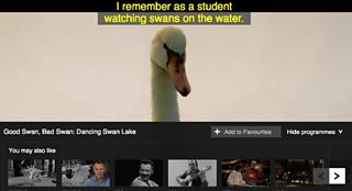
One reoccurring piece of feedback was that it was impossible to tell from the search results page which programmes were audio described or subtitled. We addressed this by listing all programmes in the search results page together with the alternative formats they are available in such as AD (Audio Description), SL (Sign Language), HD (High Definition) and SD (Standard Definition). Just as before Audio Described and Signed also get their own Category while you can turn on Subtitles on all on-demand content using the subtitles button from within the player.
��
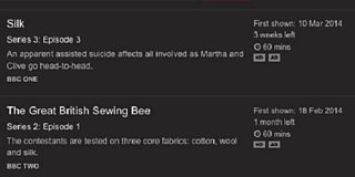
Search results listings now show Audio Described and Signed programmes
Design was not signed off until it was annotated for accessibility. The site was broken down into page templates and shared modules, the wireframes for which were then annotated to ensure what was being proposed could be made accessible, how, and to iron out any major issues prior to development. Typically annotated UX would include:
• Structure – annotations for headings, sub headings, lists and areas for WAI ARIA (Web Accessibility Initiative Accessible Rich Internet Applications) Landmarks
• Keyboard access – visible focus states for elements and unique selected states (e.g. for menu items), clarification of where to set focus when page content updates, content order and focus order
• Colour – meeting the 4.5:1 colour contrast minimum, use of colour to reinforce meaning (and not rely on it)
This proved invaluable. Even though the UX evolved as development got underway it meant we had a uniform, accessible framework from which to hang designs. It also allowed us to anticipate potential issues before they got coded. For example early on we decided that we wanted to list each programme as a list item rather than a heading. We felt pages would otherwise become overwhelmed with too many headings, which would undermine their value as a means to navigate for screen reader users.
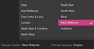
The popup box has a visible tick to show it is selected
For the benefit of sighted non-mouse users care has been taken to ensure clear focus states are used as well as unique selected states. To avoid confusion for those that may not be able to differentiate colour some features, such as the Change Language and Change Location module, also include a visual prompt, a tick, to make it very clear what is selected and what is focused.
Another outcome of annotating UX was that we were able to build up �鶹Լ�� iPlayer specific requirements for accessibility, above and beyond the �鶹Լ�� standards and guidelines, which are particular to the needs of the site. For example, with regards to the main heading of pages, the H1, we decided it should always follow the ‘main’ Landmark in the content order. This meant consistency across templates which makes pages much easier to follow for screen reader users across desktop, tablet and mobile. This is important as different development teams work on different parts of the site so it could have been easy to have a slightly different structure on each page.
Finally we also ensured that all Landmarks were followed by a correctly marked up heading in the content order. iOS VoiceOver, up to and inclusive of iOS6, does not announce the name of the Landmark but instead announces just ‘Landmark’ i.e. ‘Landmark’ not ‘Navigation’. Adding a heading immediately after in the content order means that iOS VoiceOver announces the Landmark and heading as one item giving all Landmarks a unique and understandable name. This bug has since been addressed in iOS7 however coupling Landmarks with headings is still valuable in the site today.
Development
Working in an agile, sprint run environment we then looked at how we could embed accessibility into development. Our goal was to ensure that accessibility was considered part of overall development rather than an-add on. We avoided allocating a single ‘accessibility Sprint’ to do all the accessibility work and instead added user stories and tasks for accessibility into each Sprint as well as included accessibility into acceptance criteria for other relevant user stories or tasks. This was taken from the annotated UX and meant that developers knew up front how best to code a feature.
There were challenges along the way. UX sometimes changed, or new releases in technology meant we had to rethink development. The new iPlayer menu on mobile and tablet, while accessible, is not as usable as it was prior to changes in iOS7 however we are be working to address that.
Fortunately other changes in technology meant other issues were fixed. For example in earlier versions of iOS6 there was a bug where zoomed content would be momentarily cut off when devices were in landscape. Our standards require that pinch zoom is supported which meant the layout would appear broken to some users. This was fixed in iOS6 so we are now able to support people who like to zoom without compromising or breaking the design.
��
Pinch zoom is enabled within new iPlayer as per the �鶹Լ�� Mobile Accessibility Guidelines
The Standard Media Player
The new �鶹Լ�� iPlayer uses the new �鶹Լ�� Standard Media Player (SMP). The new player offers clearer visual design for buttons, good contrast, keyboard and mouse accessible tooltips. Work has also gone in to improving subtitles; we now have support for different colours for different speakers on catch up content.
The Media Player with subtitles at the top so they are more prominent
We’ve also improved keyboard access as well as labels for screen reader and voice input users. This is a challenge as different assistive technology and browsers have variable support for Flash plus upgrades to browsers and screen reader software can break something that previously worked.
Finally we are testing out the ability to change the size of the player controls to help users with lower vision or mobility impairments. This currently works in Firefox using Control + Shift + P or O and is not a fully-fledged feature yet as we explore more about it.
Standard Media Player also introduces plugins to the playback experience. You can add the programme you’re watching to your Favourites as well as discover more episodes and related programmes from within the player. These features and functionality are available from within the page but obviously make content a lot easier to use when available from within the player. It cuts out the overhead of having to navigate out of the player, find something else to watch, update the page, navigate back to the player and start again. This is an example of how we can make iPlayer not just accessible but also much more usable for disabled users with the introduction of new features which are beneficial to everyone.
You can find out more in our .
Testing
We submitted the site for third party testing which included expert technical testing as well as usability testing with disabled users. This helped understand better what features people liked and how we could tweak them to make them better. It was useful to see just how much people relied on pinch zoom when on mobile as well as tweak the logic of our headings for screen reader users. Hopefully during the preview, we will gather more feedback that we can work into the designs.
So that’s a quick tour of some of the accessibility work that’s gone into iPlayer.
��As iPlayer evolves so will the accessibility. Hearing feedback from you and other users is invaluable and really helps us better understand how to make iPlayer more usable so if you have any comments or questions please post them below or email us at mailto:accessibilityteam@bbc.co.uk.
Henny Swan is Senior Accessibility Specialist, UX&D, �鶹Լ�� Future Media