
This week聽we launched a. As our MVP () release, this replaces the old feature phone Weather site with an optimised experience for feature phone and smartphone users.
It's a work-in-progress, and the first step in our plans to move to a fully responsive web solution on mobile, tablet and desktop. In true , we're expecting to roll out more features and content over the coming months. Naturally we're also listening to our users as we prototype and tweak new features.
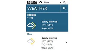
The new mobile site includes recent locations and horizontal scrolling
Almost half our audience access Weather from mobile and tablets, and like so many online products this proportion is only going to increase. I know that many of our users (around 19%) are catered for via our Android and iOS apps, but it's been a priority for us to make sure the website is also optimised for a multitude of devices.
From previous user feedback, we can see the success of the iOS and Android app has been its simplicity and ease of use. Therefore, it's no surprise that we followed these design patterns for the responsive version of the site. Smartphone users will immediately notice the introduction of horizontally-scrolling day tabs and hourly information, like the app.
However, one key difference for web site development is the depth and richness of content available. Our covers everything from simple location forecasts to detailed tide and coastal data, video, picture galleries, maps and infographics. We will need to reflect this in future iterations of the responsive site. For this reason, the first iteration of the responsive site is opt-in at . We won't be automatically redirecting mobile users until we have built a satisfactory base of content and features on that platform.
Approach and prototyping
Back to the drawing board to bring together design patterns across devices and platforms
Naturally, it's been a 'mobile first' strategy for the new site and we've been keen to bring in more consistent designs patterns across all our Weather products. In the last three months, we've employed a cycle of prototyping, testing, and building to release the first version of the responsive site.
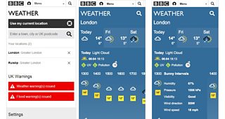
One of the key new ideas for launch is our 'Recent Locations' functionality, which stores the user's last five weather forecast locations for easy access and passive personalisation. Main features of new site include:聽
* Location Search auto-suggest
* Recent locations functionality - stores your last five locations
* Horizontally scrolling hourly forecast and detail slots for smartphones
* English/Welsh versions integrated via settings
* Weather measurements available in metric or imperial
* Link to Met Office Severe Weather Warnings information
* Link to Environmental Agency Flood Warnings information
* Feedback email link to 'Tell us what you think'
Feedback
If you've already seen , you'll have noticed the bright yellow banner asking you to 'tell us what you think'. We've already had a healthy flow of responses - some positive, some less so. We are monitoring these responses carefully and will address any issues that come up.
Many feature phone users are missing the 5 day overview so we will be reintroducing it soon
One issue coming through loud and clear is that many users on more basic phones are missing the old vertical five-day overview. We're addressing this now and will be reintroducing the overview in the next few weeks. Feel free to tell us what you think and, if you have a particular issue, it's always helpful to tell what device you're using.
That's all for now, but I'll keep you posted on new developments and the next stages in the future.
Mike Burnett is an executive product manager for 麻豆约拍 Weather