
Today we’re announcing �鶹Լ�� iWonder, a bold new brand whose mission is to unlock the learning potential of all �鶹Լ�� content.
We know that people's curiosity is often sparked by �鶹Լ�� programmes, and also by the world around them. �鶹Լ�� iWonder is for these curious minds, and at its' heart is a new content format, interactive guides. Guides will invite people to lean forward, and actively explore a range of factual and education topics from Science and Natural History, Arts, History, Religion and Ethics, Food and more. In this blog post, I’ll outline the features of iWonder interactive guides, as well as what to expect from this new format in the near future.
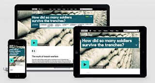
Interactive guides on three screens
A new way to tell stories on the web
Interactive guides take a different approach to presenting content compared to traditional web articles or TV and radio programmes online. They organise video and audio, rich infographics, written summaries, and activities into stories that make the most of our interactive medium. We know from plenty of research that people learn better by doing, and we’ve designed our guides to be “sit forward,” placing a user’s interactions with the content at the core of the experience. Interactive guides take the audience through a series of steps that ask them to look at multiple perspectives of intriguing questions, always with the chance to reflect on the significance of the story at the end.
The initial set of interactive guides mark the start of the on the �鶹Լ�� and are presented by experts including , Kate Adie, Ian McMillan and Neil Oliver. For more on these read Executive Producer Tim Plyming’s
A multi-screen modern media landscape
More and more of our audiences are accessing our content via mobile and tablet devices. In fact, for the first time this past Christmas, the proportion of people visiting the from a tablet or smartphone was larger than those visiting from a PC. This trend is set to continue. With the look and feel of “native mobile applications” getting ever more immersive, our audience’s expectations of accessing content on their phones and tablets is high. Expecting our users to struggle to navigate a full “desktop” website on a tiny screen isn’t acceptable any longer.
We all instinctively know that learning is not something that happens at a single time or place only, sitting quietly at a desk or with a PC. Our guides display beautifully no matter what screen size you view them on, accompanying you as you move through your life - at school, home or work, while you're on the go, or while you wait for something else to happen.
To achieve this, our team has employed from our first lines of code. With responsive web design, the devil is in the detail. On mobile especially, response times are absolutely crucial. If a web page takes longer than a couple of seconds to load, you’ve already lost a huge percentage of potential browsers. To keep response times down to a minimum, we’ve had to develop a system that loads in just the essential components of the page at the right times. Mobile-sized images download first, then when the page’s Javascript detects the browser’s capabilities, higher-resolution images get ‘loaded in dynamically.’ This can mean the difference of up to a mega-byte’s worth of content for a browser to download. At that , a mobile browser can become agonisingly slow.
For pictures with a dense amount of information on them, such as , it’s important not just to resize a smaller version of a big image, but to load in a completely different image that’s best for that screen. Usually this means a more “zoomed in” view right for mobile. Our system elegantly handles all this image swapping without the user ever noticing. Try reducing the width of your browser window to see it in action
We’ve strived for this ‘invisible’ elegance in other places too. For instance, we load in the correct media player for any device behind the scenes, so that visitors on an iPhone don’t get served a Flash player, which won’t work on their Apple device. In this way, everyone should get exactly the same high-quality experience, all the time.
The �鶹Լ�� also has a firm commitment to both web accessibilityand backwards compatibility, making our experiences just as pleasing on older browsers such as Internet Explorer 8 as on newer, more capable web browsers. We’ve taken care to ensure that for users with Javascript turned off, or for those using screen readers, all the content is both available and understandable.
Being able to repeatedly produce immersive experiences
Over the past year or so, many highly engaging web experiences have delighted web audiences, such as the . When our development team first set out to imagine what our interactive guides experience should be, we looked at those examples with a degree of envy. But we also noticed that most seemed to be “one-offs” and didn't work well on mobile devices. We were adamant that we wanted our new format to have all the qualities of this class of highly immersive story - but tailored for every device - whilst being straightforward for our editorial teams to reproduce quickly and repeatedly.
Those were the three main principles which guided our development, and are the reason the iWonder interactive guides represent such a giant leap forward in the �鶹Լ��'s ability to inspire and support learning. Our editorial colleagues now have a toolkit that lets them to put together and publish these rich stories in hours or days, rather than the weeks that it might have taken just a year or so ago. And whereas in the past, each rich story experience would require its own bespoke code and design, there's now just one codebase to maintain and add features to.
In the coming months, we’re adding a collection of activities that will sit within the guide format's sequence of ‘steps’. Look out for visual quizzes, clickable infographics, and plenty of other digital toys to play with, as the library of options available to our production team grows.
I'd love you to know what you think, so please do leave a comment.
Andy Pipes is Executive Product Manager, Knowledge and Learning