
Hello,
Over the last year, the has been updated. The new versionŐżis currently only available on smartphones and is in 'beta' on tablets and desktop. Next year however, it will be moved out of 'beta' to become the default ¬ť∂Ļ‘ľŇń News website across all devices. In this post, I'll explain how you can get an early view of what this will look like on your tablets and tell us what you think.
How to access the new responsive site
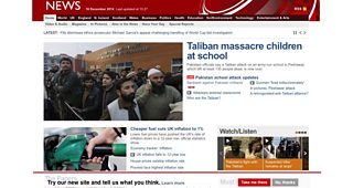
In the next week, if you viewŐżthe existing (internally referred to as the 'static site') on a tablet device, you'll notice that a banner will appear pinned to the bottom of your screen offering you the opportunity to check out the new responsive version. You'll also have the opportunity to find out more about what we're working on or to stay on the existing version of the website. The options available from the static site banner are:
‚ÄĘSelect 'Learn more' to bring you to this blog post.
‚ÄĘSelect 'Take me there' to visit the new responsive website.
Note: By opting into responsive News you will see the mobile versions of the Sport and Weather websites on your tablet. To switch to the tablet optimised versions of these products, please click on the ‚ÄėDesktop site‚Äô link at the very bottom of the page.
‚ÄĘSelect 'No thanks' to dismiss the banner (which will move it to the very bottom of the website, out of sight).
The static site banner will look like this on your tablet:
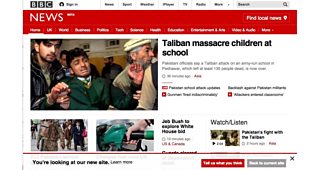
If you select 'take me there', you'll land on the responsive front page which will look like this:
When you arrive on the responsive site for the first time, you'll be presented with a second banner which will provide the following options:
‚ÄĘSelect 'Learn more' to bring you to this blog post
‚ÄĘSelect 'Tell us what you think' to open a survey where you can provide feedback on what you think about the new responsive site.
‚ÄĘSelect 'Back to the current site' to take you back to the existing static version of the site. You can still get back to the responsive version again though - simply scroll to the bottom of the page and select 'take me there'.
‚ÄĘSelect the 'crosshair' icon to dismiss the banner. This will move the banner to the bottom of the responsive site out of your way.
Why are we doing this?
We want to find out what you think of the responsive site before we take it out of 'beta' and make it the default experience across all devices.
We conducted a similar exercise from 17th March to 10th April this year when we showed a small percentage of the audience (of the static ¬ť∂Ļ‘ľŇń News website) a banner inviting them to try out the new responsive website. This gave a percentage of the global online audience on tablets and computers the chance to opt-in to responsive for the first time so that they could let us know what they thought - in total more than three thousand of you did this.
We learnt a lot from this and since then we've been working hard to improve the responsive website further.
After recieving the results of the survey conducted back in April, we created several new designs for the front page, section pages and articles to address the feedback you provided. The new designs were shown to audience members in a range of locations around the UK and also in the US to get further feedback. There is still plenty of work to do before the existing site can be replaced with the shiny new responsive one but we've now settled on a version of the responsive design which we feel works well across all devices in all geographical locations and even though it's not finished, we think it's time to let you take a look at it again.
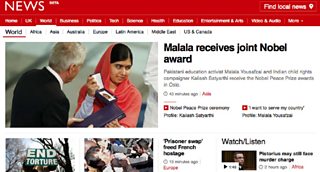
An example of a section on the responsive site:
What did we learn from the previous survey?
Of those who opted into the responsive site earlier this year and provided feedback via the survey, a large proportion were male, UK based and heavy users of the existing website. Most respondents were using a computer to view the site - At the time of running the survey we still had alot of work to do to optimise the responsive experience for these devices and tablets and therefore we expected to recieve comments that some functionality was missing on responsive however the feedback was broadly positive and it enabled us to learn alot about the enhancements you felt most strongly about us needing to make.
Őż
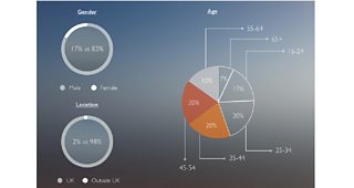
A summary of the demographics for those of you who responded
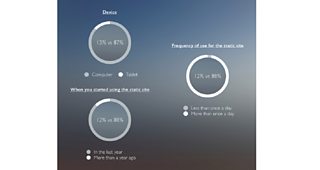
A summary of the device types you used and how you told us you currently use the site
Most of the positive comments referred to the look and feel of the site, using words like ‚Äėclear‚Äô, ‚Äėfresh‚Äô and ‚Äėuncluttered‚Äô. In terms of specific features, some people mentioned the "Most Read" box and others mentioned the new "time stamps" as aspects they liked. Some of the positive verbatim comments were:
‚ÄĘ‚ÄúFresher look, more modern.‚ÄĚ
‚ÄĘ‚ÄúClean look obviously optimised for smaller, tablet or smartphone displays.‚ÄĚ
‚ÄĘ‚ÄúCleaner, more attractive design‚ÄĚ
‚ÄĘ‚ÄúI like the most read tab at the top as this is the part of the site I use most.‚ÄĚ
The most common complaints were about the content being too spaced out and there being less news visible in the initial view. Users also found it fairly easy to see the top stories of the day, but more difficult to find news for their local area or to find a specific story they were looking for. Some people praised the clear and uncluttered design, whilst others found it over-simplified and didn’t like having to scroll to find content. Some of the related verbatim comments were:
‚ÄĘ‚ÄúThere's less information on the screen. So I have to scroll more to see different headlines.‚ÄĚ
‚ÄĘ‚ÄúIt is not so easy to visualise a lot of news on the one page. You have to search around for what you want.‚ÄĚ
‚ÄĘ‚ÄúFont too large. Feels childish.‚ÄĚ
In the new version of the responsive site, we've introduced many new features in direct response to the feedback you gave us from the survey and from the learnings we made from the user testing sessions. Some of the main ones are that we've:
‚ÄĘIntroduced a function to find your local news faster - this can be accessed from the navigation on your smartphone or via the link above the navigation on tablets and desktop devices
‚ÄĘEnhanced the design across all templates to make it faster and easier to find what you're looking for, especially on the front page and main section pages
‚ÄĘUpdated the coverage of live events through the introduction of a new template
‚ÄĘRe-ordered the content on the front page and section pages to make the content hierarchy clearer
‚ÄĘIntroduced a new way of discovering the best 'explainer' content by introducing a new section called 'Explainers' and promotion for this section from the front page
‚ÄĘEnabled a new way of discovering the top content from our reporters by introducing a new section called 'The Reporters' and promotion for this section from the front page
‚ÄĘMade it clearer where you have the ability to comment on responsive articles i.e. through the introduction of the comment icon on our promos
In summary,ŐżI hope many of you will choose to check out the responsive site on your tablets and that you'll like the direction we're taking the site in. If you have never viewed the responsive website before, please spend a little time exploring it and send us some feedback. I'd love to hear what you think so that we have the opportunity to make any changes before rolling it out further - as previously stated, this will only happen once we are satisfied that the beta site meets the high standard we have set ourselves. So please do give feedback on the tablet beta and I'd also be interested in your comments.
Niko Vijayaratham is Senior Product Manager, ¬ť∂Ļ‘ľŇń News