¬ť∂Ļ‘ľŇń Sport: Updated Cricket and Rugby Union beta pages based on your feedback

James Manning
Senior Product Manager
Tagged with:
Last month, Ben Gallop we are making to the ¬ť∂Ļ‘ľŇń Sport website. Ben explained that mobile and tablet devices are being used more and more to access our content and that we are changing our website to meet the challenges this presents.

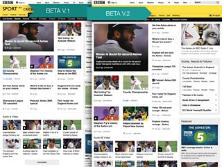
Changes are planned to the ¬ť∂Ļ‘ľŇń Sport website
We launched new responsive beta versions of our Cricket and Rugby Union homepages designed to adapt to the different screen sizes you are using and invited you to complete a short survey letting us know what you think.
We have received thousands of responses to the survey in the month since we launched these betas. We have also been keeping track of users’ comments on Ben’s original blog. Today, I want to update you on the feedback we’ve received and some changes we’ve made as a result. I’ll then mention what happens next.
The positives
Many of the survey responses and user comments were very positive, with many of you saying that the new design is easy to use, clear, well laid out and easy to scan. Many also said that they found content they wouldn’t have found otherwise.
Three quarters of you who completed the survey said you are likely to spend more time, or the same amount of time, on the new pages. Over half of you said that the quality of the content was better than on the existing pages and that you were happy with the level of detail on the new pages.
Over half of you gave the new pages 7, 8, 9 or 10 out of 10 in terms of overall quality.
The not-so-positive
We also received some less positive feedback about the new design, where you said you preferred the existing design and didn’t want the pages to change.
Some of you also said that there was too much white space and that it felt like there was less content. Some also mentioned that certain parts of the pages, like the “Team by Team” area, were harder to scan and use. Live radio commentaries were also harder to find.
These issues contributed to a quarter of users scoring the pages 1-4 out of 10.
We also received feedback from some users saying that they would prefer to keep separate desktop and mobile versions of the site, with the option to choose to view the more detailed desktop version on mobile or small tablet devices and pinch and zoom, swiping across as well as down to view the pages.
Changes in the update to the Cricket and Rugby Union beta pages
We’ve listened to your feedback and made some changes to the beta pages for you to try. These changes should keep the best of what people liked about the first version, while improving on the things people said they didn’t like.
We've introduced a central column list of headlines into the design which is similar to the way we display headlines on the existing pages for desktop users. We’ve added a summary to the first item and added a promo into the top of the right-hand side of the page.
These changes should make the page feel more like what our users are accustomed to, make more headlines visible higher up the page and make the page easier to scan.
Beta pages updated after feedback
Some further changes we had planned to roll-out shortly were also backed up by your feedback, so we’ve prioritised these.
We’ve improved the design of the “Team by Team” area, moving to four columns and aligning the content more. This change should make this area easier to scan and make it easier to find things.
We’ve also brought across the “Live on the ¬ť∂Ļ‘ľŇń” area from the existing pages that lists radio commentaries and other sport related ¬ť∂Ļ‘ľŇń programmes. This change should make this content easier to find and also help further with making the page easier to scan. We have also simplified the way our live pages are displayed on these pages.
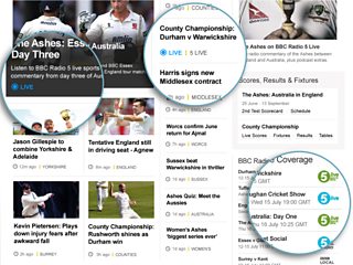
Live sport across the ¬ť∂Ļ‘ľŇń is easier to find
We understand that some of you would prefer to keep the separate desktop and mobile versions of the site we offer now, but this has several drawbacks which make it difficult to offer users a high quality of service across the massive variety of devices available today.
We don’t want to offer you a diminished service just because your screen of choice is smaller. A single, responsive site allows us to offer the same content to our users across all of their devices, including making popular content like scores, schedules and tables more accessible and easier to find on mobile devices.
We will keep an eye on demand for a view that you can zoom in and out on and also continue to explore technology that allows us to offer users more choice regarding how their content is displayed on the different devices they use.
What’s next?
You can now view the changes mentioned above and tell us what you think. Take a look on:
We’ll compare the survey responses and comments about the updates with the feedback we received from the first versions of the betas. We’ll continue to keep you updated about the changes we’re making and the feedback we’ve received.
We’re looking forward to hearing what you think of the updates.