How to display data
We know that we can display information in many different ways.
We might write a list, summarise information in a table, draw a bar chart or line graph, thinking carefully about the scales on both axes, and so on!
A pie chart is just another example of how we could represent data pictorially.
What are pie charts?
Pie charts show proportions such as a fraction of a whole and NOT total amounts.
Fractions, decimals and percentages are examples of proportions. The circle (360 degrees) represents the whole and the separate parts (or sectors) fit together to make the whole (circle).
Line graphs and bar charts are examples of statistical diagrams where we can read the amounts by just interpreting the scales on the given axes.
In this part of mathematics we learn to understand why some ways of displaying data may be more effective than others.
Example 1
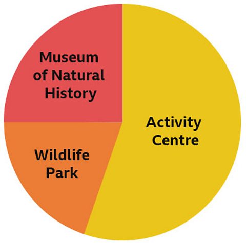
A school decides to organise a special event for all Year 6 pupils in their last term of primary school. The pupils can choose just one of three different options.
The pie chart below shows the results.
Letâs consider whether the following statements are TRUE or FALSE.
- 25% of Y6 pupils chose the Museum of Natural History.
This is true!
- If 16 pupils chose the Wildlife Park and this is 20% of all the Y6 pupils, then this means that the pie chart represents a total of 80 pupils.
This is true!
20% is equivalent to one fifth and one fifth of 80 is 16
- 60% of the pupils chose the Activity Centre.
This is false!
One whole = 100%, so the correct answer is 55% because 55% + 25% + 20% = 100%
- The angle of the sector representing the Wildlife Park is 72°.
This is true!
10% of 360 = 36, so 20% of 360 = 36 x 2 = 72
- The fraction of the whole pie chart that represents the Activity Centre is eleven twentieths.
This is true!
55% = 55/100 which cancels down to 11/20
Example 2
In this example, there are two pie charts. This is because we want to compare the results of two different schools.
Both schools have decided to collect and then display information about recycling âTin cansâ and âPlastic bottlesâ in their respective schools.
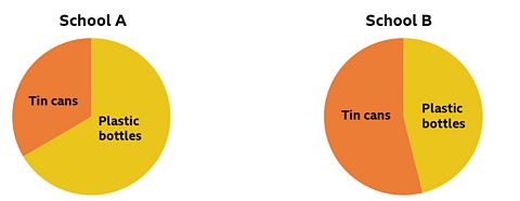
Once again, letâs consider whether the following statement is TRUE or FALSE.
- In School A more plastic bottles were recycled than in School B.
This could be true or it could be false.
This is because we have not been told the total amount of items that have been recycled in each school.
If we knew the total of items, then we could work out what each the amount each sector represents for both of the schools.
However, it would be true to say that in School A a greater proportion of plastic bottles were recycled than in School B.
Example 3
The pie chart below represents the number of pupils in three different classes in a school.
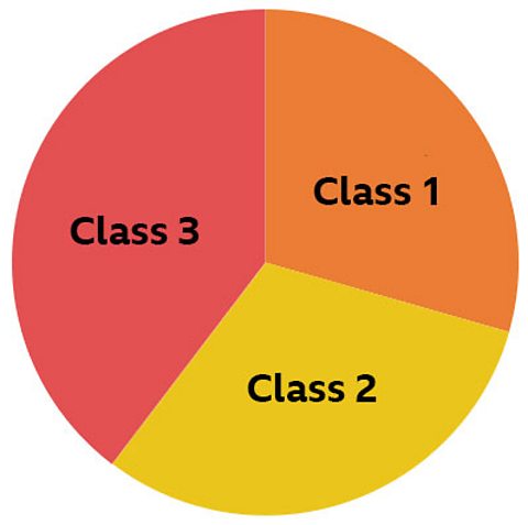
We are also told the angle of the sector for each of the three classes:
| Class | Angle of sector |
|---|---|
| 1 | 100° |
| 2 | 120 ° |
| 3 | 140 ° |
| Total | 360° |
- Class 1 has the fewest pupils.
- Class 3 has the most pupils.
If the total number of pupils in all three classes was 72, then we can work out:
- One child in the school is represented by 5 degrees.
72 x 5 = 360 or 360 Ă· 72 = 5
- There are 20 children in Class 1.
100 Ă· 5 = 20
- There are 24 children in Class 2.
120 Ă· 5 = 24
- There are 28 children in Class 3.
140 Ă· 5 = 28
We can check we are correct by adding all the classes together and this should make 72.
20 + 24 + 28 = 72
Quiz
NEW! Play Guardians: Defenders of Mathematica - the Halloween update. game
Experience Mathematica as youâve never seen it before, with all-new backgrounds and costumes for Halloween. Available for a limited time only. Use your maths skills to save the day before it's too late!

More on Tables, graphs and charts
Find out more by working through a topic
- count4 of 8
- count5 of 8
- count6 of 8

- count7 of 8