What is a geographical enquiry?
Geographical enquiries can involve researching the human and physical environments. They are a way of investigating questions about the world we live in and learn how processes work.
There are six steps to follow in a geographical enquiry.
- Planning
- Fieldwork
- Processing and presenting data
- Analysing and interpreting data
- Conclusion
- Evaluation
In this article we look at the last four steps in a geographical enquiry. You can learn about the first two steps - planning and fieldwork - in Geographical enquiry т part 1
Once the first two steps have been completed itтs time to look at the data that has been collected.
Watch: Geographical enquiry - Part 2 video
Watch this short clip to learn about what to do with the data collected in a geographical enquiry and how to form a conlusion and evaluate the enquiry.
Welcome to the wonderful world ofтІ geographical enquiry! With six exciting steps to complete, itтs two down and four to go. And just because the planning and fieldwork stages are out of the way, that doesnтt mean that the fun stops. The next step is processing and presenting data. Once weтre done with our fieldwork, we need to make sure we understand everything, and present our findings to other people. This is where we begin making sense of the data weтve collected. Which means graphs. Lots and lots of graphs.
Yes, yes, weтre all very excited. But donтt just rush into a graph, willy-nilly. Make sure you choose the best way to present the data that you want to show.
A bar chart can show any changes in velocity in Gwenтs river survey while a cross-section drawing is the best way of displaying the width and depth of the river.
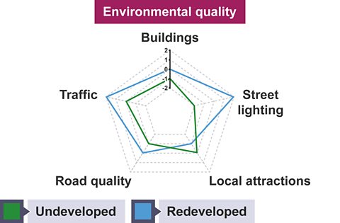
Jason meanwhile, wants to compare two sets of data. What he needs is a radar graph.
Heтs studied two areas of his home town - one thatтs been recently developed, and one thatтІ hasnтt.
After asking people to score various things - the quality of the roads and buildings, local attractions, street lighting, and so on - he can show the differences between the areas by colour-coding his graph. Or thereтs always a pie chart. Thatтs perfect for getting to the bottom of all those multiple-choice questions youтve been asking everyone, Jason.
Remember to mix things up. Itтs never good to use the same graph or diagram over and over again. Try a word cloud. Itтs a great way of turning peopleтs opinions - the words they use most often - into visual data.
Now itтs time to describe any patterns or trends you see in the data. You may think you know the reason for those trends, but hold on for now. That comes later. You can even show how the various graphs and diagrams youтve made interact with each other. This is also where you point out any anomalies - data that you didnтt expect.
But most of all, this is your chance to show your understanding of the data. How processes like erosion shape a river, for example, or the impact urban development has on job opportunities, and amenities like parks, schools and shopping centres.
OK. Deep breath, everyone. Weтre almost there. But to reach our conclusion, we need to go back to the beginning.
Oof. I think thatтs the wisest thing Iтve ever said.
Go back to your original question and - yep - answer it. Or look at your hypothesis and decide whether itтs true or false. This is where you explain or justify your data and show off all that fantastic reasoning youтve been saving up all this time.
The last step is evaluation - where you ask yourself what youтd do differently next time. Remember to consider each one of our six steps. Iтm sure you know them by heart at this point.
Are there any questions that you didnтt consider, which now seem relevant? And if someone else were to ask the same question, would they get the same answer? Was your question worth asking in the first place? And was it so open-ended that you produced some very different answers? Ask yourself how accurate your methods of collecting data were. But remember - even the most watertight hypothesis can throw up some surprising results. The depth or width of a river can vary wildly, which can cause problems for a study like Gwenтs.
Even the weather can lead to the same enquiry giving different results on different days - flooding could completely change the measurements of a river, for example. Were all your graphs, diagrams and photos relevant? You can even evaluate your own conclusion. Did you actually manage to answer the question? Showing youтve learnt from your mistakes is the final step on our epic journey through the world ofтІgeographical enquiry! Whether or not weтve got our answers, there are always more questions to ask.
When the weather improves. Fine.
Processing and presenting data
Once data has been collected it needs to be sorted and organised into data tables. This data can then be presented neatly in different types of graphs to display the results clearly.
All graphs should be drawn neatly with a pencil and a ruler, and contain the following:
- title
- labelled axis
- key
- colour
Bar charts
Bar charts are used to display the amounts of different sets of data.
For example, when carrying out an enquiry about traffic, the results for a survey of vehicles travelling along a road in both directions would be put in a data table.
| Type of vehicle | To the city | From the city | |
|---|---|---|---|
| Car | 240 | 320 | |
| Van | 32 | 40 | |
| Lorry | 24 | 9 | |
| Motorbike | 5 | 2 | |
| Bike | 0 | 0 | |
| Walk | 1 | 0 | |
| Other | 3 | 15 |
This data can be displayed in a bar chart where the different values can be compared.
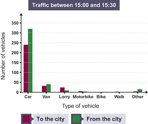
Advantages of bar charts
- Clearly display data which makes it easy to make comparisons between different values.
- Clearly show what has scored highest and lowest.
Disadvantages of bar charts
- Not useful for showing change over time.
- Not useful for identifying relationships between two sets of data.
Line graphs
Line graphs are often used to show change over time. For example, a line graph could be used to display the results of a survey of pedestrians in one location over the course of a day.
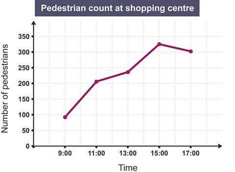
Advantages of line graphs
- Clearly display data.
- Trends can be identified.
Disadvantages of line graphs
- Not useful for displaying percentages.
- Not useful for making comparisons of different singular sets of data.
A river cross-section shows us the depth and width of the river. It is similar to a line graph, but with the x-axis placed at the top.
Radar graphs
Radar graphs can be used to display data from environmental surveys. Each of the arms have a scale and the closer the line is to highest number, the more positive the result of the survey.
For example, a radar graph can be used to display and compare the results of an environmental survey about two contrasting areas of a town. In this graph, the larger the pentagon shape, the more positive the score.
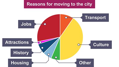
Pie charts
Pie charts show percentages as a circle, divided into segments. They can be used to display data from different kinds of geographical enquiries, for example when collecting qualitative data using a questionnaire and asking people why they moved to live somewhere.
Analysing and interpreting data
Analysis involves describing the results.
For example, you can identify the trend shown in a graph.
- Does the graph increase or decrease slowly?
- Does the graph increase or decrease steadily or rapidly?
- Does the graph fluctuate (rise and fall irregularly)?
Use figures from the graph to describe the changes it shows as evidence to support any trend that you have identified. Always aim to give amounts near the start, the middle and the end. Be as accurate as possible when reading from the graph and always use units when quoting figures, eg cm, m, km.
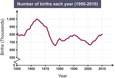
For example, analysis of this graph showing the number of births over a number of years could say that:
- in 1964 there were 1,000,000 births
- over time the graph has fluctuated
- overall the trend has decreased from 1,000,000 births in 1964 to 810,000 births in 2010
Mode, median, range and mean
To develop analysis further you can look at the mode, median, range and mean of a data set, for example data collected in a traffic survey.
| Type of vehicle | To the city | |
|---|---|---|
| Car | 240 | |
| Van | 32 | |
| Lorry | 24 | |
| Motorbike | 5 | |
| Bike | 0 | |
| Walk | 1 | |
| Other | 3 |
The mode is the most common number. In this set of data the mode is 240 for cars.
The median is the middle number when the data is placed in order from highest to lowest. In this set of data where the numbers are 240, 32, 24, 5, 3, 1 and 0, the median is 5.
The range is the difference between the highest and the lowest number. In this set of data the range is 240 which is the difference between the number of cars and the number of bikes.
The mean is calculated by adding up the numbers in all the categories then dividing the total by the number of categories.
For this set of data:
- add up the total for each category (cars, vans, lorry, motorbikes, bikes, walkers and other) to give a total of 305
- divide 305 by 7 (the number of categories) giving a mean of 43.57
Interpreting data
Interpreting the data that has been collected involves explaining:
- the different reasons for the results and graphs
- the patterns and trends in the information
Conclusion
The conclusion is a summary of your findings. To write a conclusion look back to your hypothesis or to your question and sub-questions.
For example, in a river investigation, the enquiry question - the main question you have asked - could be тDoes the river change from the source to the mouth?т
The sub-questions, used to break down this main enquiry question into smaller parts, could be:
- does the velocity of a river change along its course?
- what happens to the width and depth of the river as you go downstream?
- does the size and shape of pebbles change along the course of a river?
When answering these questions you may need to combine key findings from different data sets to provide evidence for the answer, eg river velocity, pebble shape and size, width, depth, gradient and maps.
The overall conclusion will be to answer your main question. You can draw on the answers to your sub-questions when forming this answer.
Include an answer to your hypothesis in your overall conclusion. Can you prove or disprove your hypothesis? You may give reasons and evidence to support your conclusions.
Evaluation
Take time to evaluate the enquiry. This evaluation can be based on the answers to three main questions.
- What are the strengths of the enquiry?
- What are the weaknesses of the enquiry?
- How might the project be improved if it was to be completed again?
These questions should focus on different aspects of the enquiry.
- Data collection methods
- Sampling techniques
- Data presentation methods
When you consider how the project could be made even more effective if it was done again, these are the kind of questions you could ask.
- Would you ask the same question or could you make the project smaller and more focused?
- Did you gather enough data or would you change the sampling technique and collect more data?
- Did you present all the graphs accurately?
- Would you look to challenge yourself and try to draw different graphs?

More on Geographical skills
Find out more by working through a topic
- count1 of 2