Data can be presented in many ways that make it quicker and easier to read.
In this section we will look at some of these ways. It is important to choose the best way to present data.
Frequency tables
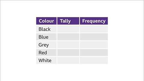
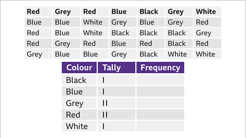
When a lot of data needs to be sorted, one of the most efficient ways is to use a The number of times something occurs. table. This is a way of organising data and making it easier to read.
- A frequency table has at least two columns.
- The last column shows the total or frequency for each item.
A middle column showing a way of recording data that counts in groups of five. Each occurrence is shown by a tally mark and every fifth tally is drawn diagonally to make a “gate” of five. The tallies can then be counted. can sometimes be useful.
Example
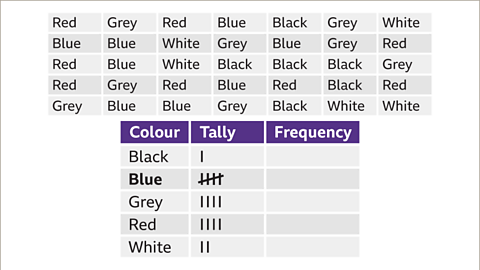
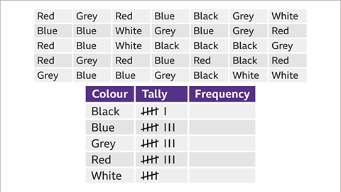
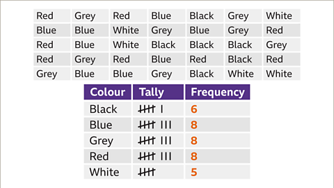
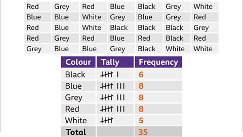
This is the data gathered from a survey about the colours of cars in a car park.This data can be displayed in a frequency table.
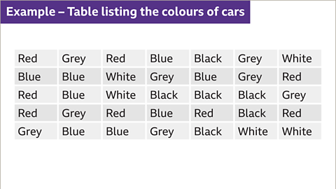
Image caption, This is the data gathered from a survey about the colours of cars in a car park. This data can be displayed in a frequency chart.
1 of 7
Grouping data on a frequency table
When a lot of data needs to be sorted, one of the most efficient ways is to use a frequency table.
It is important to consider the sizes of groups when sorting data into a frequency table.
Example
Megan owns a bakery. She counts the number of customers she has each day at lunchtime on 30 consecutive days. The results are shown here.
| 13 | 8 | 16 | 12 | 12 | 16 |
| 7 | 18 | 11 | 16 | 15 | 7 |
| 11 | 12 | 13 | 21 | 17 | 19 |
| 11 | 14 | 10 | 19 | 13 | 12 |
| 7 | 16 | 6 | 14 | 12 | 18 |
Using this data in list form could be time consuming and with a large set of data it may lead to mistakes or miscalculations. A grouped frequency table would help to display and give an overview of the data. The smallest number is 6 and the biggest number is 21, so groups that have a width of 5 are reasonable - this will give a reasonable amount of groups to work with, and the smaller the groups, the more accurate the analysis will be.
| Number of customers | Tally | Frequency |
|---|---|---|
| 5-10 | \(\cancel{||||}~|\) | 6 |
| 11-15 | \(\cancel{||||}~\cancel{||||}~||||\) | 14 |
| 16-20 | \(\cancel{||||}~||||\) | 9 |
| 21-25 | \(|\) | 1 |
Question
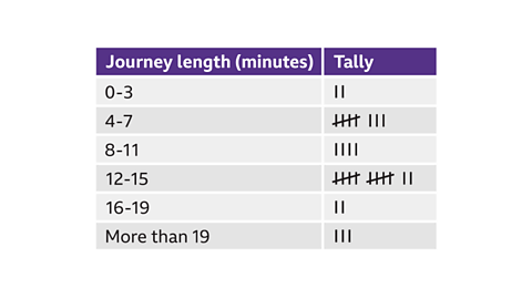
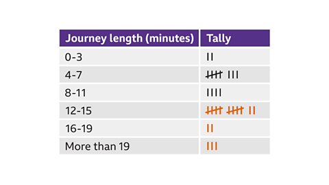
The chart below shows the results of a survey where people were asked how long it takes them to walk to school.
How many people took more than 11 minutes?
Answer:
17 people had a journey length of more than 11 minutes.
More than 11 minutes means the people who had a journey time of 12 minutes or more. This includes everyone in the 12–15, 16–19, and more than 19 class intervals.
Pictograms
Pictograms use pictures to represent data. To make sense, a pictogram must always have a key.
In a pictogram it is important to make sure that each picture is the same size, equally spaced out and lined up one beneath the other.
Reading pictograms
This pictogram below shows the number of pizzas eaten by four friends in the past month.
The key tells you that one pizza on the pictogram represents \(4\) pizzas eaten, so Alan ate \(4 + 2 = 6\) pizzas.
Pictogram showing the number of pizzas eaten by 4 friends in the past month
Question
Who ate the most pizzas?
How many pizzas did Bob eat?
What was the total number of pizzas eaten by the four friends?
Answer:
Chris ate the most pizzas.
Bob ate 4 + 4 + 1 = 9 pizzas
Notice that each pizza on the pictogram represents 4 pizzas, so ÂĽ circle represents 1 pizza.
- Alan ate 6 pizzas
Bob ate 9 pizzas
Chris ate 19 pizzas
Dave ate 12 pizzas
6 + 9 + 19 + 12 = 46 pizzas

How many coffees were sold?
Each cup represents 2 drinks.
Coffee has 3 cups. 3 x 2 = 6
There were 6 coffees sold.
How many 'other' drinks were sold?
Each cup represents 2 drinks.
While half a cup represents 1 drink.
'Other' has 2 full cups and one half cup. 2 + 2 + 1 = 5
There were 5 others sold.
Bar charts
A bar chart is a diagram which uses rectangular bars, of equal width, to show frequencies. The heights of the bars show the frequency of the categories.
It is easy to pick out the most popular as it will be the tallest bar.

Question:
What was the most popular pet?
Answer:
A cat was the most popular pet as cat has the tallest bar.
Question:
How many children chose rabbits?
Answer:
4 children chose rabbits
Question:
How many more children chose a dog than a fish?
Answer:
A dog was chosen by 9 children and a fish was chosen by 3 children.
6 more children chose a dog than a fish.
Question
Leon conducts a survey to find the number of people in each of the cars arriving at the school gate between 8.30am and 9.00am.
His results are shown in the bar chart below:
Bar chart showing the number of people in each car arriving at school
How many cars contained 1 person?
How many cars contained more than 3 people?
Why are there only a small number of cars containing 1 person?
How many cars arrived at the school gate between 8.30am and 9.00am?
Answer:
8 cars contained 1 person
14 cars contained more than 3 people (10+4=14).
Most cars would be driven by parents bringing their children to school - only a few would contain one person (such as a teacher or a sixth former).
64 cars (8+20+22+10+4).
Comparative bar charts
Bar charts can be used to compare data. A stacked bar chart can show the frequency of items for two more groups.
The following frequency table shows the information for the numbers of pets owned by a class.
| No pets | 1 pet | 2 pets | 3 or more pets | |
|---|---|---|---|---|
| Boys | 2 | 4 | 2 | 3 |
| Girls | 3 | 3 | 2 | 1 |
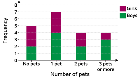
This stacked bar chart is showing information about number of pets owned as well as comparing the number of boys and girls who own the pets.
Example
How many girls had more than one pet?
Answer
2 girls had 2 pets and 1 girl had 3 pets, so 3 girls had more than one pet.
A dual bar chart can also show the frequency of items for two more groups with the bars placed side by side.

Which of the following statements is true?
- The number of students with blue eyes in year 8 is greater than the number in year 7.
- The number of students with green eyes in year 7 is greater than the number in year 8.
- The number of students in year 7 is less than the number in year 8.
Answer
The number of students with green eyes in year 7 is greater than the number in year 8.
Test yourself
More on M1: Handling data
Find out more by working through a topic
- count3 of 6