Harmonious colours
Harmonious colours sit beside each other on the colour wheel. These colours work well together and create an image which is pleasing to the eye.
Harmonious colours may also be referred to as analogous colours.
A harmonious colour scheme uses three to five colours that are beside each other on the colour wheel. For example:
Three-colour harmonious set:
- Yellow
- Green-yellow
- Green
Five-colour harmonious set:
- Blue-green
- Blue
- Blue-purple
- Purple
- Red-purple

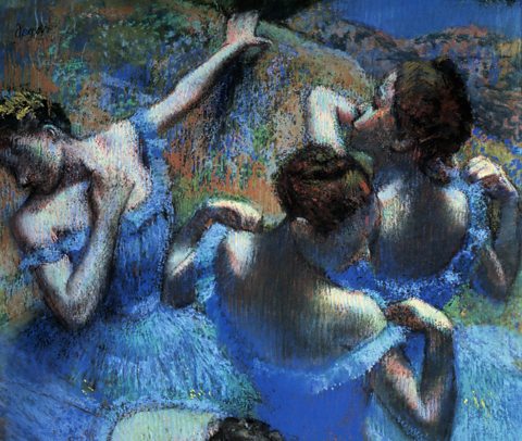
In Blue Dancers (1899) Edgar Degas uses harmonious blue and green pastels that create a calm atmosphere.
Blue, blue-purple and blue-green tints in the dresses are repeated in the background, linking it and the subjects.
These cool colours contrast with warm red, pink and yellow-brown in the dancers’ skin and the space around them.


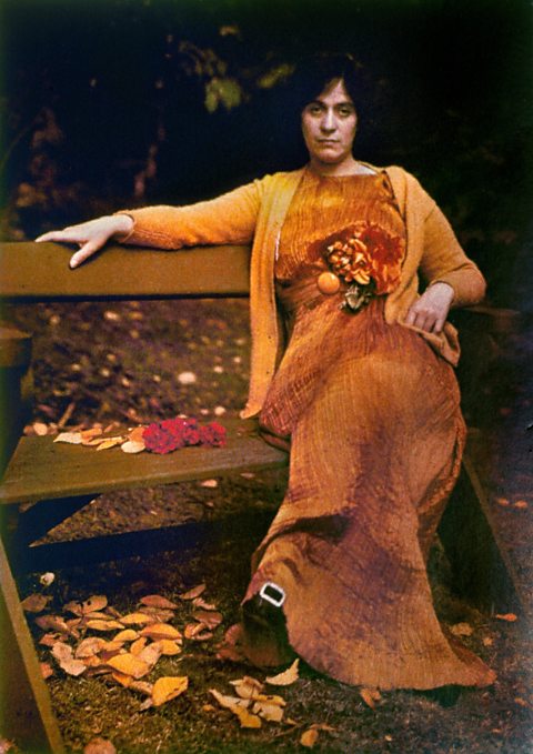
In this photograph of Mrs Selma Schubart (Arthur Stieglitz, 1907) the orange tone of the dress harmonises with the lighter tint of the cardigan and with the fallen leaves and red petals on the bench.
The use of similar colours creates a sense of harmony between the dress and the natural autumn surroundings. The result is a warm and relaxed composition.

Complementary colours
complementaryWorking together in a way that creates contrast and emphasises differences or other qualities. sit across from each other on the colour wheel.
These are often referred to as opposite colours and even contrasting colours. Don't be confused by the three different names, they all mean the same thing.
When complementary colours are placed next to each other, a very strong contrast is created. The colours appear more vivid and brighter. Some people say these colours clash when used next to each other and create very visually stimulating artwork. The complementary colours are:
- Green and red
- Orange and blue
- Yellow and purple
- Yellow-green and red-purple
- Yellow-orange and blue-purple
- Red-orange and blue-green

In Van Gogh's Self portrait (1889), the blue of his shirt matches the background colour.
The blue complements the bright orange of the beard and hair and the greenish colour of Van Gogh’s face.
The painting palette and brushes are similar colours to the artist’s skin. There are patches of orange, green and pink paint on the palette. These make a visual link between the artist and his work that stands out against his surroundings.
