Key points
- Different types of graphs and charts are needed to present results from experiments.
- Graphs and charts need to be drawn and labelled correctly.
- Use patterns in the data to reach a conclusion in an experiment.
True or false?
It is easier to see patterns in data from a graph than a table.
True.
Many people find graphs or charts much easier to understand. They can often see patterns or trends that are much harder to spot in tables of data.
How to pick the correct chart
Watch this video on how to choose a graph or chart and how to draw them.
While you are watching, look carefully at how scales are chosen for the graph or chart
Presenter 2: We're going to focus on the correct way to lay out a graph and also draw a graph.
Presenter 1: We are going to be collecting readings for an experiment which involves timing how long a candle stays burning under a beaker. A graph is a great way to paint a picture of what the data is telling us. It helps us to see the pattern in the data.
Presenter 2: We are looking to see if there is a link between the volume of air in the beaker and the length of time the candle stays alight.
Student 1: For this one, I think it's going to be about 20тІ 20 seconds. Or maybe not. What was that?
Student 2: 22 seconds.
Student 1: Are you ready?
Student 2: Yeah.
Student 1: What do you think is going to happen this time?
Student 2: I reckon, because there's more oxygen, it'll last longer. So, I'm thinking maybe 40 seconds?
Presenter 1: Use a line graph when both variables use numbers and they are continuous. This means the numbers can take any value.
Presenter 2: When drawing a line graph, we use SALT, which stands for scale, axis, labels, title.
Presenter 1: First, we need to work out our scale т and the S in SALT т by thinkingwhat is our biggest value and what is our smallest value?
Presenter 2: For the axes, we need to decide the units we go up in.Don't forget equal spaces between each division.
Presenter 1: And the labels.
Presenter 2: And, finally, the title.
Presenter 1: Now, we plot our points.
Presenter 2: The 500 centimetres cubed beaker went out after 21 seconds.
Presenter 1: The 250 centimetres cubed beaker went out after nine seconds.
Presenter 2: The 1,000 centimetres cubed beaker went out after 40 seconds.
Presenter 1: We don't join every single point, we draw a line of best fit which has equal points above and below it. It will show us the general pattern. Sometimes, the line of best fit can be curved. This could happen, for example, if you're plotting your pulse rate against time whilst exercising. Your pulse rate would go up from your resting pulse rateтІ
Student 1: Faster, faster!
Presenter 1: тІreach peak and fall back to your resting pulse rate again when you stop exercising.
Presenter 2: The important thing is that the line follows the pattern in the data.
Presenter 1: But here in the candle experiment, our line of best fit is straight. It shows us that as the volume of air increases, so does the time it takes to candle to go out.
**Presenter 2:**Just to take stock, we have seen how to draw a graph with all the correct labels. We have also looked at drawing the line of best fit through our data.
Presenting data

After collecting and recording Words or numbers that are obtained when measurements or observations are made., scientists often put their data into a graph or a chart. This shows the data in a useful way and helps them to reach conclusions.
The most common ways of presenting data in science are A way of presenting results when there are two variables that are numbers, at least one variable should be continuous. A way of presenting data where the lengths of the bars (rectangles) represent the values of the variables. Used when one of the variables fits into discrete categories. and A way of presenting data in which a circle is split into sectors to show the proportions of a total made up of different parts. Used when one variable is discrete or categoric data..
A line graph should be used when the independent and dependent variables are A variable that has values that can be any number..
A bar chart should be used if the independent variable is A variable that has values that are words instead of numbers. Examples include gender, hair colour and the name of your school..
A variable that can only have whole number values. or categoric data can also be shown on a pie chart. Pie charts are often used when using percentages of data to draw a graph.
If both the independent and dependent variables are continuous, how should data be presented?
With a line graph.
Drawing graphs and charts

When drawing a chart or a graph, the independent variable goes on the horizontal (x) axis and the dependent variable goes on the vertical (y) axis.
Once this has been identified, follow these steps:
- Choose scales for the axes so that the graph is as big as possible on the page.
- Use a pencil and a ruler to draw axes, bars, or to To mark points on a graph in the correct position. .
- Label the axes with the quantity and the unit, such as тTemperature, ТАCт.
- Write a title for the graph.
True or false?
Units are not needed when drawing a graph.
False.
Units are important, so always include them because they give us the scale. Imagine if the race you wanted to run was in miles not metres. Or the time of a car journey was in days not hours.
How to draw graphs and charts
Presenting data in a graph or chart needs to be done carefully. As well as the four steps described above, there are other things to think about.
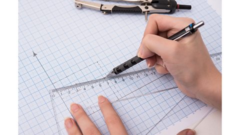
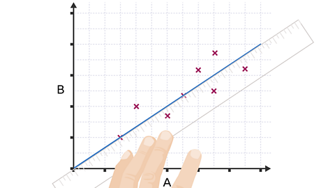
Image caption, When drawing a line graph, itтs important to look at the range for the data before drawing a simple scale. When plotting the тXsт on the graph, the data must be presented accurately.

1 of 3
True or false?
A gap should be left between bars on a bar chart if the data is not continuous.
True.
If the independent variable is not continuous, leave a gap between each bar.
Analysing data
Finding patterns in data on a graph or chart is known as тinterpreting relationshipsт.Plotting a chart or graph helps to show a pattern in the data - how the dependent variable depends on the independent variable.
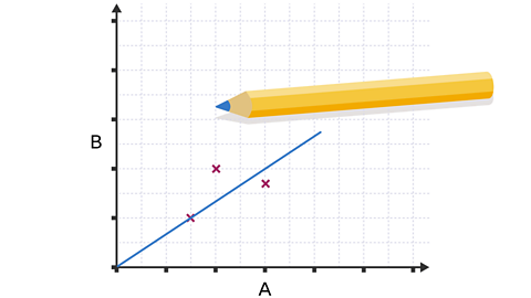
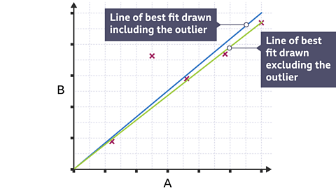
Once points have been plotted for a line graph, draw a A smooth line on a graph that goes through the middle of as many points as possible. Around half of any points that arenтt on the line are above it and the other half are below it. . The line should be drawn through as many points as possible, with equal numbers of points above and below the line. If there are any A result that is very different to other results. then these should be ignored when drawing the line of best fit.
Once the graph has been analysed, write a conclusion. Support a conclusion by saying what the graph shows, such as if there is a relationship between the two variables. A good way of describing the relationship is to say what happens to one variable as the other one increases or decreases. For example, the longer a kettle is left to boil, the hotter the water gets until it reaches 100ТАC.
A step-by-step guide on drawing a line of best fit
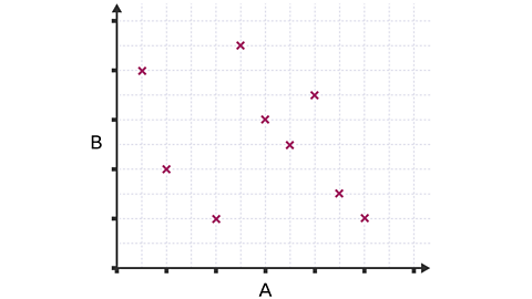
Image caption, 1. After plotting points on a graph, draw a line of best fit to present the data and make it easier to analyse. If there is no link between variables, then there will be no clear pattern of points and a line of best fit would not be drawn.
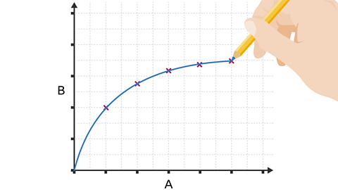

1 of 6
What is the name of a result that should be ignored when drawing the line of best fit?
An outlier should be ignored when drawing a line of best fit.
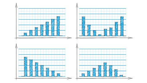
Analysing trends in graphs
When data is analysed and a relationship between two variables is described, it's important to say how changing one variable affects the other. These line graphs show some common shapes that arise when the independent variable (A) affects the dependent variable (B).
The yellow line is straight because each increase in A gives the same increase in B. This is also true in the straight parts of blue and red lines. When the blue line curves horizontally, the same increase in A gives a smaller increase in B. When the red line curves upwards, the same increase in A gives a greater increase in B.
The yellow line is straight because each increase in A gives the same decrease in B. This is also true in the straight parts of blue and red lines. When the blue line curves downwards, the same increase in A gives a greater decrease in B. When the red line curves horizontally, the same increase in A gives a smaller decrease in B.
The yellow line is straight because as A increases, there is no change in B.
On these graphs, which variable goes on the horizontal (x) axis?
The independent variable. The dependent variable goes on the vertical (y) axis.
Test your knowledge
Quiz - Graphs and charts
Did you know?

- The earliest use of a pie chart is generally credited to Scottish engineer and political economist William Playfair in 1801.
- More people heard of pie charts after the founder of modern nursing, Florence Nightingale, used them for things like showing death from diseases during the Crimean war.
Play the Atomic Labs game! game
Try out practical experiments in this KS3 science game.

More on Working scientifically
Find out more by working through a topic
- count10 of 11

- count11 of 11

- count1 of 11

- count2 of 11